Scoring genre clarity...
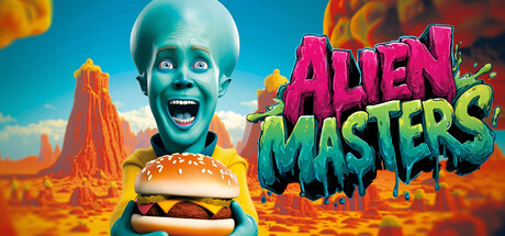
Alien Masters capsule

Alien Masters

Run your own burger van in the depths of space! Cook delicious meals for bizarre aliens and dangerous outlaws. Upgrade your kitchen with high-tech equipment, deal with ruthless space gangsters, and build the biggest fast-food empire in the galaxy!

SimulationArcadeFPS
HeadBridgesComing soon

Alien Masters scores 77/100 — better than 71% of Simulation capsules (n=5,401).

Released Coming soon · By HeadBridges

Quick text summary

Alien Masters scored 77/100 on Steam Analyzer — Good for a Simulation capsule. Top priority fix: [uniqueness_polish] Add a subtle signature visual element—a distinctive alien accessory, logo, or UI frame—that could anchor brand recognition across marketing materials and future releases.

Capsule scores by dimension

  • Genre Clarity: 8/10 — Clear casual sim with alien theme. The central alien character holding a burger immediately signals a food service/management game with comedic tone. The desert alien landscape, vibrant color palette, and exaggerated character expression strongly communicate a light-hearted casual simulation. At TINY size, the burger and alien silhouette remain the dominant read, though genre specificity (management/cooking sim) is implied rather than explicit.
  • Title Readability: 8/10 — Bold, readable at all sizes. The large magenta and lime green title text uses high contrast letters with clear kerning and sits cleanly against the blue sky background. The chunky, graffiti-style font maintains legibility at SMALL and TINY sizes without collapsing. No taglines or secondary text compete for attention.
  • Contrast & Color: 8/10 — Vibrant separation on dark background. Warm orange/red landscape, turquoise alien skin, bright magenta title, and lime green accent all create strong value and hue separation against the Steam dark background #1b2838. The glowing light sources and saturated palette ensure the composition pops in quick scroll. Grayscale squint test shows clear silhouettes with the alien and burger remaining distinct focal points.
  • Uniqueness & Polish: 7/10 — Polished indie aesthetic, playful energy. The art direction feels intentional and cohesive—exaggerated character proportions, surreal alien desert setting, and energetic lighting create visual personality beyond generic templates. The burger van concept paired with alien characters communicates a unique selling point clearly. However, the overall execution, while clean, falls short of truly distinctive polish seen in top-tier indie capsules like DAVE THE DIVER or Hades II.
  • Brand Consistency: 7/10 — Coherent art style, good identity signal. The cyan-skinned alien character design, warm desert palette, and exaggerated comic-book rendering style create a recognizable visual identity that should translate across store screenshots. The character's expression and pose feel consistent with a comedic, player-friendly brand. Internal cohesion is strong, though no singular iconic motif (character, symbol, or signature element) stands out as immediately franchise-defining.
  • Composition: 8/10 — Strong focal hierarchy, balanced layout. The alien character holding the burger anchors the center-left, drawing the eye immediately at all sizes. The title floats naturally in the upper right without competing for primary attention. Layering works well—foreground character, midground burger/hand, background desert—creating clear depth. At TINY size, the composition remains coherent; safe margins protect key elements from edge cropping.

What works

  • Immediate genre and tone clarity. The burger-holding alien instantly communicates both the food service mechanic and comedic, light-hearted vibe expected from a casual sim.
  • Title remains legible at all viewing sizes. Bold magenta and lime typography with strong contrast ensures the game name reads cleanly from TINY thumbnail up to full header without loss of impact.
  • Vibrant color palette pops on dark background. Saturated oranges, turquoises, and magentas create strong visual separation against Steam's #1b2838 background, ensuring discoverability in quick scroll.
  • Coherent art direction and visual identity. Exaggerated proportions, surreal desert setting, and consistent rendering style create recognizable brand personality without feeling derivative.

What hurts the capsule

  • Generic simulation genre visual language. While the alien theme is unique, the capsule relies on established casual sim visual tropes and does not communicate specific mechanics (cooking, management, empire-building) through visual storytelling.
  • Limited iconic brand symbol or motif. The alien character is charming but not distinctive enough to serve as a franchise signature; lacks a memorable mascot, logo, or visual hook that stands alone.

Priority fixes

  1. [uniqueness_polish] Add a subtle signature visual element—a distinctive alien accessory, logo, or UI frame—that could anchor brand recognition across marketing materials and future releases.
  2. [genre_clarity] Consider layering subtle UI hints (cash counter, kitchen equipment, or a small storefront silhouette) into the background to more explicitly signal the management/simulation core mechanic.

Related guides

Steam app ID: 3997120 · Tags: Simulation, Arcade, FPS, Shop Keeper, 3D