Rusted Flesh scores 65/100 — better than 8% of Shoot 'Em Up capsules (n=814).

Quick text summary

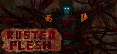
Rusted Flesh scored 65/100 on Steam Analyzer — Solid for a Shoot 'Em Up capsule. Top priority fix: [title_readability] Simplify the title font to a bolder, cleaner sans-serif with minimal serifs to maintain clarity at thumbnail sizes while keeping thematic warmth.

Capsule scores by dimension

  • Genre Clarity: 7/10 — Action combat clear, retro style evident. The cyborg figure with glowing cyan eyes and mechanical orange/rust coloring immediately signals sci-fi action combat. The grotesque corrupted aesthetic and worn industrial setting align with the run-n-gun premise. At tiny size, the menacing silhouette and color scheme still read as action-oriented, though specific subgenre details blur slightly.
  • Title Readability: 6/10 — Title legible at full, struggles tiny. The red distressed 'RUSTED FLESH' text has adequate contrast against the dark background at full size with clear letterforms. However, at tiny thumbnail size the serrated edges and texture-heavy font lose definition, and the stacked layout compresses awkwardly. The worn aesthetic fits theme but sacrifices small-size clarity.
  • Contrast & Color: 7/10 — Strong warm-cool separation, good silhouette. The bright cyan eyes and orange rust tones create distinct value separation against the dark murky background, with the central figure reading clearly even when squinting. The warm orange box and cool cyan glow establish visual hierarchy. Some mid-tone detail in the background machinery blurs slightly at tiny sizes, but core elements maintain separation.
  • Uniqueness & Polish: 6/10 — Competent retro aesthetic, generic execution. The corrupted cyborg with glowing eyes and rusty mechanical elements communicate the core theme effectively and fit the retro-inspired positioning. The distressed text treatment feels thematic but is a common indie game trope. Compared to top-tier action benchmarks like Armored Core VI or Helldivers 2, the visual presentation lacks distinctive character design or memorable hook that elevates it beyond competent.
  • Brand Consistency: 6/10 — Coherent rust and decay palette. The warm rust-orange and cool cyan electric blue color scheme is internally consistent, with the corrupted cyborg design reinforcing the 'flesh merged with machine' thematic promise. However, without distinctive character traits, icon motifs, or signature visual language, the identity remains generic within the action-horror space. The palette is cohesive but not particularly memorable or recognizable.
  • Composition: 7/10 — Clear focal hierarchy, title placement solid. The cyborg figure is well-centered as primary focus with glowing eyes directing attention, while the distressed title sits in the lower-middle area with good separation from the subject. Depth layering works with background tendrils, mid-tone machinery, and bright foreground figure. At small size the composition reads cleanly, though the lower title placement leaves some upper negative space that could be more dynamic.

What works

  • Strong cyan-orange color contrast. The glowing cyan eyes and warm rust tones create excellent value separation that reads clearly even at tiny sizes and maintains distinction in grayscale.
  • Thematic visual cohesion. The corrupted cyborg, rust palette, and industrial decay all reinforce the 'Rusted Flesh' premise consistently across the composition.
  • Clear primary focal point. The menacing cyborg silhouette with glowing eyes anchors attention effectively and guides the eye through the composition at all sizes.

What hurts the capsule

  • Title loses legibility at tiny size. The distressed serif font with serrated edges and heavy texture collapses at thumbnail scale, reducing readability when scrolling quickly.
  • Generic action-horror aesthetics. Corrupted cyborg, rust, and decay elements are familiar indie action tropes that don't offer distinctive visual differentiation from similar genre entries.
  • No memorable brand identity cues. The capsule lacks iconic character traits, signature symbols, or unique motifs that would make it instantly recognizable compared to benchmarks like Helldivers 2 or Armored Core VI.

Priority fixes

  1. [title_readability] Simplify the title font to a bolder, cleaner sans-serif with minimal serifs to maintain clarity at thumbnail sizes while keeping thematic warmth.
  2. [uniqueness_polish] Add a distinctive visual hook such as a signature weapon detail, unique corrupted anatomy feature, or memorable character silhouette that differentiates the protagonist.
  3. [composition] Increase upper-third visual interest by repositioning secondary mechanical elements or strengthening the background visual layers to use the full space more dynamically.
  4. [contrast_color] Increase the title box opacity or add a subtle glow effect to ensure maximum contrast separation at all viewing sizes.

Store copy priority fixes

  1. [feature_communication] After the opening premise, add 2–3 sentences explaining core combat mechanics: how the player moves and shoots, what the overcharge ability does in practice, and one example of enemy or boss behavior that showcases the challenge.
  2. [uniqueness] Add 1–2 sentences identifying what makes Rusted Flesh distinct—e.g., 'combines bullet-hell dodging with destructible level design,' or 'the first run-n-gun with X system,' or highlight a specific art style or difficulty innovation that sets it apart.
  3. [tone_match] Remove or rewrite the final all-caps motivational line to match the retro arcade or dark sci-fi tone—replace "WHAT ARE YOU WAITING FOR SOLDIER..." with authentic arcade-era or game-specific language that doesn't feel like generic marketing.
  4. [audience_targeting] Clarify in the short or opening detailed description whether this is a casual-accessible shooter or a hardcore 1cc challenge—explicitly mention 'whether you're seeking a story-driven action romp or a speedrun challenge' or similar anchor.

Related guides

Steam app ID: 4000040 · Tags: Shoot 'Em Up, Action, Shooter, Linear, Combat