Scoring genre clarity...

Deceived Of Joy capsule

Deceived Of Joy

Step into a Psychological Horror Experience where you live in an apartment complex where the walls between reality and nightmares are crumbling. Run for your life, solve small puzzles and use items to help you survive.

$2.99Very Positive(52)
IndieHorrorDark
LevelBound StudiosJan 6, 2026

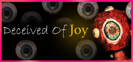
Deceived Of Joy scores 63/100 — better than 7% of Indie capsules (n=11,449).

Very Positive (52 reviews) · $2.99 · Released Jan 6, 2026 · By LevelBound Studios

Quick text summary

Deceived Of Joy scored 63/100 on Steam Analyzer — Solid for a Indie capsule. Top priority fix: [genre_clarity] Incorporate apartment window or interior architecture element to establish the apartment complex survival setting and differentiate from cosmic-horror.

Capsule scores by dimension

  • Genre Clarity: 7/10 — Horror elements clear, psychology subtle. The floating eyeballs and red organic texture on the right immediately signal horror and surreal dread, aligning with psychological horror expectations. However, the apartment complex and survival gameplay are not visually communicated—at tiny size, this reads as pure body-horror/cosmic-horror rather than psychological apartment-based survival. The eye motif is memorable but doesn't clarify the specific setting or puzzle-solving mechanics.
  • Title Readability: 6/10 — Readable but script font at risk. The title 'Deceived Of Joy' uses a handwritten script font in white and gold on a dark background, which reads clearly at full size. At small size (231×87), the script letterforms remain legible due to high contrast and adequate spacing. However, at tiny size (120×45), the thin cursive strokes collapse slightly and word separation becomes harder to parse in a quick scroll.
  • Contrast & Color: 7/10 — Strong value separation, vibrant accent. The bright magenta border, white/gold title text, and saturated red organic form create strong contrast against the dark background and eyeball field. The red textured orb on the right stands out clearly even at small size due to high saturation and luminosity separation. In grayscale, the value range holds, though the midtone eyeballs become slightly muddier and the red loses its alarm signal potency.
  • Uniqueness & Polish: 6/10 — Striking imagery, but familiar horror tropes. The eyeball motif and red pulsing texture create a visceral, unsettling visual hook that reads as deliberate craft. The combination of cursive title font and organic body-horror imagery suggests intentional art direction. However, floating eyes and cosmic-horror aesthetics are common in indie horror, and the capsule doesn't communicate what makes this specific game's psychological survival experience distinct—it could apply to many indie horror titles without modification.
  • Brand Consistency: 5/10 — Cohesive but generic horror identity. The dark palette, eyeball imagery, and red accents form an internally consistent horror mood. The handwritten script font adds personality, but without reference to the game's actual apartment and character narrative, it reads as a generic psychological-horror brand rather than a specific game identity. There are no iconic character, location, or symbolic motifs that would make this capsule uniquely recognizable as 'Deceived Of Joy' versus another horror title.
  • Composition: 7/10 — Clear focal point, balanced layout. The red organic form on the right serves as a strong primary focal point, drawing the eye while the eyeball field provides texture depth without competing. Title placement in the left-center avoids edge cropping and remains readable across sizes. The magenta border frames content safely, and the dark gradient background allows the title and orb to sit on controlled zones—composition is clean and supports legibility at small size.

What works

  • Strong focal point and depth. The red organic form on the right creates an immediate visual anchor, while the eyeball field adds layered background texture without cluttering the title area.
  • Title placement and contrast. White and gold script text sits on a dark, uncluttered region with high value separation, remaining readable even at small capsule size.
  • Vibrant color accent. The saturated magenta border and red orb pop against the #1b2838 background and create visual urgency appropriate for horror.

What hurts the capsule

  • Generic horror iconography. Floating eyeballs and pulsing red organic forms are common indie-horror visual language, offering no unique selling point or game-specific story hook.
  • Setting and gameplay unclear. The capsule communicates body-horror dread but does not visually suggest the apartment complex setting, survival mechanics, or puzzle-solving that define the actual game.
  • Script font at tiny size. While readable at small size, the handwritten cursive strokes lose definition below 120px width, potentially harming recognition in store thumbnails or quick scrolls.

Priority fixes

  1. [genre_clarity] Incorporate apartment window or interior architecture element to establish the apartment complex survival setting and differentiate from cosmic-horror.
  2. [uniqueness_polish] Add a silhouetted character or survival-related item (e.g., key, door, barricade) to communicate puzzle and survival mechanics beyond just horror atmosphere.
  3. [title_readability] Convert script font to a bold sans-serif or semi-serif variant that maintains personality but retains legibility below 120px, or add a subtle black outline to improve tiny-size clarity.
  4. [brand_consistency] Introduce a recurring visual motif or color accent that would appear across store screenshots and menus to build a recognizable game identity.

Store copy priority fixes

  1. [feature_communication] Add a single concrete example of a puzzle type or item mechanic early in the detailed description (e.g., 'You must gather clues scattered across shifting rooms to unlock locked doors') to ground gameplay in specificity.
  2. [uniqueness] Insert a 1-2 sentence differentiator after the pill reveal explaining what makes this game's take on psychological horror distinct (e.g., 'Unlike traditional horror, you control how much of the truth you uncover' or 'The game's reality shifts based on your choices, not pre-set events').
  3. [audience_targeting] Add an explicit audience signal sentence after gameplay time (e.g., 'Ideal for players who prioritize atmospheric storytelling over action, featuring no combat and a focus on exploration and decision-making').
  4. [hook_strength] Lead the short description with the pill concept rather than generic walls/nightmares framing to differentiate from standard horror setups (e.g., 'You took a pill that erases doubt. Now it's wearing off, and reality is unraveling around you.').

Related guides

Steam app ID: 4001800 · Tags: Indie, Horror, Dark, Mystery, Abstract