Quick text summary
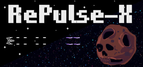
RePulse-X scored 68/100 on Steam Analyzer — Solid for a Side Scroller capsule. Top priority fix: [uniqueness_polish] Introduce a distinctive visual hook—either a signature color palette, iconic game mechanic visualized (e.g., unique pulse effect or shield indicator), or character element that differentiates from generic space shooters.
Capsule scores by dimension
- Genre Clarity: 8/10 — Retro arcade shooter clearly communicated. The pixelated asteroid with skull design, starfield background, and minimalist spaceship silhouette immediately signal a retro arcade shooter. At tiny size, the hostile celestial object and sparse enemy indicators remain readable and genre-appropriate, though the roguelite aspect is not visually distinct.
- Title Readability: 7/10 — Bold pixel font, readable at all sizes. RePulse-X uses a clean, blocky pixel typeface with strong white letterforms against the black starfield, maintaining legibility from full size down to tiny thumbnails. The title placement in the upper portion with clear breathing room prevents collision with the asteroid focal point, though at tiny size fine pixel details compress slightly.
- Contrast & Color: 8/10 — Strong value separation, clean silhouettes. Crisp white title text and spaceship silhouettes contrast sharply against the deep space black background #1b2838, with warm rust-brown asteroid providing mid-tone interest without muddying the read. At small and tiny sizes, the light-dark hierarchy holds firm and elements maintain clear edges in grayscale.
- Uniqueness & Polish: 6/10 — Competent retro aesthetic, generic execution. The capsule delivers expected arcade retro visuals with pixel art and starfield, but lacks a memorable hook or distinctive visual storytelling that sets it apart from generic space shooter templates. The skull asteroid is thematic but represents familiar arcade tropes rather than a unique selling point or core mechanic differentiator.
- Brand Consistency: 5/10 — Limited identity signals, minimal branding. The design shows a coherent retro pixel aesthetic but provides few memorable identity markers beyond standard arcade conventions—no iconic character, signature color palette, or visual motif that would be recognizable across store assets. The title font and skull asteroid are functional but not distinctively branded to RePulse-X specifically.
- Composition: 7/10 — Clear hierarchy, balanced focal point. Title anchors the top with strong horizontal weight, while the asteroid dominates the right-center as primary focal point, leaving left-side negative space that guides the eye effectively. At tiny size the composition remains readable with no edge collision, though the dashed line element (possibly a trajectory) adds minor visual noise without clear purpose.
What works
- Instant genre recognition. Retro pixel art combined with hostile asteroid and starfield immediately communicates arcade shooter gameplay.
- Excellent contrast against Steam dark background. White typography and ship silhouette pop cleanly against black space, maintaining legibility at all viewing sizes.
- Readable title at thumbnail size. Bold pixel font and top placement ensure RePulse-X remains legible even at 120×45 resolution.
What hurts the capsule
- Generic arcade template feel. Skull asteroid and starfield follow familiar space shooter conventions without a distinctive visual hook or unique selling point.
- Weak brand identity signals. No iconic character, signature palette, or memorable motif that creates recognizable brand cohesion across other assets.
- Ambiguous dashed-line element. The dashed lines on the left appear purposeless and create visual clutter without supporting composition or gameplay clarity.
Priority fixes
- [uniqueness_polish] Introduce a distinctive visual hook—either a signature color palette, iconic game mechanic visualized (e.g., unique pulse effect or shield indicator), or character element that differentiates from generic space shooters.
- [brand_consistency] Add a recognizable motif or symbol (logo, repeating design element) that creates lasting brand identity and can be reused across store screenshots and marketing materials.
- [composition] Remove or clarify the dashed-line element on the left; replace with purposeful compositional elements like trajectory guides, power-up hints, or wave indicators that reinforce arcade roguelite identity.
Store copy priority fixes
- [hook_strength] Replace the opening question "Will you accept the challenge?" with a more specific, gameplay-forward hook that emphasizes the visual evolution mechanic, e.g., "Watch your ship evolve from 2-bit monochrome to cutting-edge graphics as you fight your way back to survival."
- [feature_communication] Add a dedicated sentence explaining gun customization and combat options, e.g., "Unlock and customize weapons as you progress, adapting your loadout to counter increasingly difficult alien waves."
- [audience_targeting] Add a sentence clarifying difficulty and playstyle, e.g., "Perfect for players seeking quick arcade sessions and long-term roguelite progression chains" to help target the right audience.
- [uniqueness] Expand the modding section to 2-3 sentences explaining scope, ease of use, and community features to position this as a meaningful differentiator, not an afterthought.
Related guides
Steam app ID: 4002010 · Tags: Side Scroller, Shoot 'Em Up, Roguelite, PvE, Shooter