Ninjora Echoes scores 77/100 — better than 77% of Ninja capsules (n=109).

Quick text summary

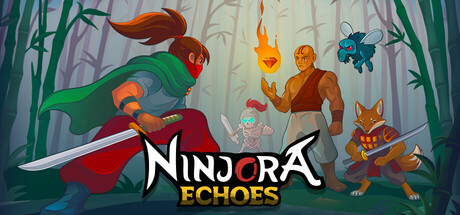
Ninjora Echoes scored 77/100 on Steam Analyzer — Good for a Ninja capsule. Top priority fix: [genre_clarity] Add a subtle visual affordance (glowing clone outline or split-screen effect) to emphasize the shadow clone mechanic more clearly at small sizes.

Capsule scores by dimension

  • Genre Clarity: 8/10 — Strong ninja action adventure signals. The capsule immediately communicates action-adventure through multiple clear visual cues: a prominent ninja character with red/orange color palette in the foreground left, sword-wielding pose, shadow clones visible in the background, and forest setting with Asian aesthetic. At tiny size, the ninja silhouette and sword remain recognizable, though the secondary characters and puzzle mechanics are less apparent than pure action intent.
  • Title Readability: 8/10 — Clear logo with readable hierarchy. The 'NINJORA ECHOES' title uses a bold white serif-influenced font with strong contrast against the mid-tone background, split across two lines with 'NINJORA' in standard white and 'ECHOES' in golden-yellow accent. At small and tiny sizes, the logo maintains excellent legibility and the color separation aids parsing; however, the decorative serif styling becomes slightly softer at thumbnail scale.
  • Contrast & Color: 8/10 — Vibrant warm palette with strong value separation. The composition leverages warm oranges, reds, and golds for the protagonist and supporting characters against cooler greens and blues in the background forest, creating clear silhouette separation. The white title text pops distinctly against the mid-tone background, and in grayscale the character subjects maintain strong luminosity contrast that reads well even at tiny thumbnail size.
  • Uniqueness & Polish: 7/10 — Polished indie aesthetic with familiar tropes. The artwork demonstrates clean vector-style illustration, intentional character design, and coherent color grading that feels premium for indie. The shadow clone mechanic is visually hinted through the multiple ninja poses, adding specificity; however, the forest setting and young hero archetype are relatively common in indie action games, preventing a higher score despite solid execution.
  • Brand Consistency: 7/10 — Consistent art style with recognizable character. The protagonist Hiko has a distinctive orange-red color scheme and dynamic pose that could become iconic across marketing materials. The consistent illustrated aesthetic, warm color palette, and Asian-inspired forest setting create internal cohesion; however, without seeing additional store assets, it is difficult to confirm whether this palette and character design are reinforced across the full brand identity.
  • Composition: 8/10 — Clear hierarchy with intentional focal point. The lead ninja character dominates the left-center foreground with a dynamic upward pose drawing the eye immediately, while supporting characters and environmental detail create depth layers without competing for attention. The title sits in the bottom half with adequate spacing from edges; at small sizes the composition remains clear, though at tiny thumbnails the secondary characters blur into background noise but the primary ninja and title remain distinct.

What works

  • Strong genre communication. Ninja character pose, sword, shadow clones, and Asian forest setting immediately signal action-adventure gameplay at all viewing sizes.
  • Excellent title contrast and placement. White and golden-yellow text sits on controlled background with clear value separation that reads sharply even at thumbnail scale.
  • Warm color harmony and silhouette clarity. Orange-red protagonist and supporting characters create vibrant visual interest while maintaining strong contrast against cool greens and the Steam background color.
  • Clear focal hierarchy. Lead character dominates foreground with dynamic pose, supporting elements guide depth without cluttering the primary subject.

What hurts the capsule

  • Generic setting reduces distinctiveness. Forest backdrop and young hero archetype feel familiar in indie action games, limiting memorable visual identity beyond competent execution.
  • Secondary characters lose clarity at tiny size. The shadow clones and supporting ninja figures in the background become indistinct at thumbnail scale, weakening the puzzle-mechanic visual story.
  • Serif font softness at small sizes. While readable, the decorative serif style in 'NINJORA' becomes slightly blurred and loses its distinctive character definition at very small capsule scales.

Priority fixes

  1. [genre_clarity] Add a subtle visual affordance (glowing clone outline or split-screen effect) to emphasize the shadow clone mechanic more clearly at small sizes.
  2. [uniqueness_polish] Introduce a distinctive environmental or UI element unique to Ninjora that differentiates it from generic ninja-in-forest tropes.
  3. [title_readability] Strengthen the serif letterforms with a subtle outline or slightly heavier weight to maintain character definition at thumbnail scale.

Store copy priority fixes

  1. [hook_strength] Rewrite the short description to lead with the shadow clone mechanic: 'Control young ninja Hiko and his shadow clones—create tactical duplicates to solve puzzles, overcome obstacles, and defeat the monk Doku in this puzzle-platformer.'
  2. [tone_match] Inject warmer, more playful language into the opening and character descriptions to match the 'cute' tag and indie sensibility—e.g., 'Pochi the loyal pup offers tips' instead of generic 'helpful companions.'
  3. [audience_targeting] Add one sentence clarifying difficulty and accessibility: 'From puzzle enthusiasts to platforming veterans, Ninjora Echoes scales to your skill level' or similar, to align with 'Playable without Timed Input' category.

Related guides

Steam app ID: 4003290 · Tags: Ninja, Beat 'em up, Adventure, Hack and Slash, 2D Platformer