Scoring genre clarity...
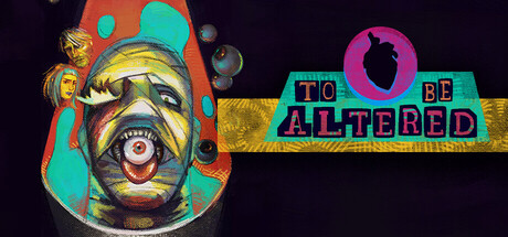
Uncover the mystery of the Ghoul's Grove, hidden in the Australian outback and filled with strange and mutilated scare actors. To Be Altered is a multiple-ending visual novel where your choices matter, even the most minuscule decisions will decide the fates of Darcy and others.
$9.995 user reviews
ActionRPGInteractive Fiction
SKELLYBED ProductionsOct 22, 2025