There's No Differences: Monsters scores 68/100 — better than 18% of Casual capsules (n=10,153).

Quick text summary

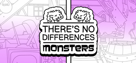
There's No Differences: Monsters scored 68/100 on Steam Analyzer — Solid for a Casual capsule. Top priority fix: [uniqueness_polish] Replace background map texture with a simpler, darker gradient or solid color to reduce visual noise and strengthen focus on the monster characters at TINY size.

Capsule scores by dimension

  • Genre Clarity: 7/10 — Casual puzzle game evident. The two nearly-identical cute monster characters with a 'spot the difference' visual hook immediately signal a puzzle game mechanic. The cartoon art style and side-by-side comparison layout clearly communicate the genre intent. At TINY size, the dual monster silhouettes and text still read as a puzzle game, though fine detail differences become harder to parse.
  • Title Readability: 8/10 — Bold text reads well overall. The title 'THERE'S NO DIFFERENCES' in uppercase black sans-serif on a white banner background has strong contrast and maintains legibility at SMALL size. The secondary line 'monsters' in lowercase sits cleanly below. At TINY size the text remains readable due to high contrast and clean positioning, though some kerning tightness appears.
  • Contrast & Color: 7/10 — Bright magenta pops against dark. The vibrant purple-pink background creates strong value separation from the Steam dark background #1b2838, and the white banner with black text sits prominently in the center. At TINY size the color blocks remain distinct, though the subtle line-art texture in the background becomes noise that slightly muddies the overall read. The silhouettes of the monsters maintain clear edges in grayscale.
  • Uniqueness & Polish: 6/10 — Clean execution, generic concept. The capsule is well-crafted with a cohesive sticker-badge design and readable typography, but the core visual—two similar cartoon monsters side by side—follows a familiar spot-the-difference template that many casual games use. The cute monster art is pleasant but lacks a distinctive hook or memorable visual identity that separates this from other indie puzzle games.
  • Brand Consistency: 6/10 — Consistent but not distinctive. The cartoon monster character design, magenta color palette, and friendly sticker aesthetic appear consistent with the game's casual tone and likely match store screenshots based on the cohesive art direction. However, there are no iconic symbols, signature motifs, or unique visual markers that would make this capsule instantly recognizable as belonging to 'There's No Differences: Monsters' rather than a generic difference-spotting game.
  • Composition: 7/10 — Centered layout, clear hierarchy. The two monster characters frame a centered white banner containing the title, creating natural left-right visual balance and a strong focal point. The foreground monsters, mid-ground banner text, and background map texture establish clear layering. At SMALL size the composition reads cleanly, though at TINY size the background detail becomes slightly distracting and the monsters compress slightly, reducing their visual impact.

What works

  • High contrast title treatment. White banner with bold black sans-serif text ensures the game title remains readable even at TINY size against the bright magenta background.
  • Clear genre communication. The dual monster comparison layout immediately signals a spot-the-difference puzzle mechanic without requiring text interpretation.
  • Strong color separation. The vibrant magenta background pops distinctly against Steam's dark background, drawing quick attention during scroll.

What hurts the capsule

  • Generic visual hook. The side-by-side monster comparison follows a common casual game template and lacks distinctive visual storytelling or unique selling point.
  • Background texture noise. The subtle map/city line-art pattern in the background becomes visual clutter at smaller sizes and distracts from the primary subject.
  • Limited brand identity. No iconic character, logo, or signature visual element that would make this capsule uniquely recognizable as belonging to this specific game.

Priority fixes

  1. [uniqueness_polish] Replace background map texture with a simpler, darker gradient or solid color to reduce visual noise and strengthen focus on the monster characters at TINY size.
  2. [brand_consistency] Add a small distinctive logo, icon, or signature element (e.g., magnifying glass, unique badge design, or character mark) that becomes a recognizable brand symbol across promotional materials.
  3. [contrast_color] Consider darkening the background map lines or removing them entirely to increase the silhouette clarity and value separation of the central monster and banner elements.

Store copy priority fixes

  1. [hook_strength] Rewrite the detailed description opening to lead with a specific, compelling reason to play—e.g., 'Hunt for 10 cleverly hidden differences across increasingly tricky monster scenes, with new layouts every playthrough to keep you guessing.'
  2. [uniqueness] Add 1–2 sentences explicitly articulating what makes this game distinct—e.g., 'procedurally varied puzzles,' 'charming monster cast,' or a unique art/theme hook that competitors lack.
  3. [feature_communication] Remove the 'we didn't really count' apology and replace it with concrete information about procedural generation scope (e.g., 'hundreds of unique difference combinations' or 'infinite replayability').
  4. [audience_targeting] Add a sentence that speaks directly to the intended player—e.g., 'Perfect for a quick brain-break or cozy puzzle session with family and friends' or 'Ideal for players who love relaxing, low-stress games'.

Related guides

Steam app ID: 4004810 · Tags: Casual, Point & Click, Puzzle, Cute, Hand-drawn