Scoring genre clarity...
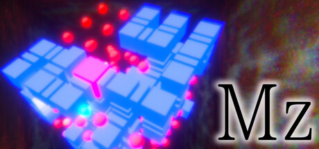
This is a 3D maze game. You can move not only forward, backward, left, and right, but also up and down. You have an incomplete map in front of you. Walk around the maze to complete the map. Once you have completed the map, you can exchange it for money and buy items to go back into the maze.
$3.991 user reviews
CasualExplorationPuzzle
GAMN IT softSep 29, 2025