Scoring genre clarity...

That Level Again 2 capsule

That Level Again 2

That Level Again Part 2 A small logic game where all levels are the same but ways to win are not. The character just want to leave the house. Sounds easy, isnt't?

$2.99Positive(29)
CasualPuzzle PlatformerPuzzle
IamTagirNov 18, 2025

That Level Again 2 scores 72/100 — better than 43% of Casual capsules (n=10,153).

Positive (29 reviews) · $2.99 · Released Nov 18, 2025 · By IamTagir

Quick text summary

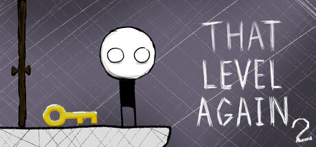
That Level Again 2 scored 72/100 on Steam Analyzer — Good for a Casual capsule. Top priority fix: [uniqueness_polish] Add a subtle visual cue or icon that hints at the 'same level, different solutions' core mechanic—such as subtle repeating shapes or a layered/duplicate element—to create immediate mechanical clarity and stronger brand differentiation.

Capsule scores by dimension

  • Genre Clarity: 7/10 — Puzzle logic game implied. The stick figure protagonist and golden key create a puzzle/escape room impression, supported by the 'That Level Again' text suggesting repeated challenge mechanics. At tiny size, the minimalist stick figure and key silhouette still read as a logic puzzle element, though the exact genre (logic vs. platformer vs. escape) remains slightly ambiguous without the full context.
  • Title Readability: 8/10 — Clear sans-serif title placement. The title 'THAT LEVEL AGAIN 2' uses a clean, readable sans-serif font positioned on the right side against the dark diagonal pattern background, ensuring adequate contrast and clear letter separation. At small size the title remains legible; at tiny size the text compresses but maintains readability due to generous letter spacing and high contrast white-on-gray.
  • Contrast & Color: 8/10 — Strong silhouette and value separation. The white stick figure and yellow-gold key stand out sharply against the dark gray diagonal-hatched background, with clear value separation that survives grayscale conversion. The bright yellow key especially pops as an accent color, and the white outline of the character maintains crisp edges even at tiny size, supporting quick visual recognition during scroll.
  • Uniqueness & Polish: 7/10 — Minimalist aesthetic with charm. The stick figure design paired with the golden key and simple line art conveys a deliberate minimalist style rather than generic placeholder art, creating a light, approachable tone suitable for a casual puzzle game. However, the visual execution, while clean, does not demonstrate exceptional craft or a unique visual hook beyond the minimalist concept—it reads as competent indie execution without memorable storytelling or mechanical visual cues.
  • Brand Consistency: 6/10 — Minimal repeated identity signals. The stick figure and key appear to be core motifs that could serve as recognizable brand elements, but at a single capsule view there are insufficient internal identity cues—no consistent palette beyond white/yellow, no signature typography treatment, and no distinctive art direction that differentiates this from other minimalist indie games. The minimalist line-art approach is the primary identifier, though this style is common in the indie space.
  • Composition: 7/10 — Balanced focal point with clear hierarchy. The white stick figure dominates the left-center area as the primary focal point, with the golden key anchoring the lower left and the title text balanced on the right, creating a clear visual hierarchy without clutter. The composition reads well at all sizes, though at tiny size the figure and key merge slightly into a single blob, reducing the distinctness of supporting elements; safe margins are respected and the diagonal background pattern does not overwhelm the subject.

What works

  • Strong value contrast against dark background. White character and yellow key create excellent silhouettes that pop against the #1b2838 Steam background, maintaining clarity at all viewing sizes including thumbnail mode.
  • Clean title typography and placement. Sans-serif 'THAT LEVEL AGAIN 2' is well-positioned on a controlled background region with sufficient contrast and spacing, remaining readable at small and tiny sizes without collapsing.
  • Minimalist, approachable visual identity. Stick figure and key design immediately communicates a casual, accessible puzzle game tone that suits the indie market and lowers intimidation barriers for potential players.

What hurts the capsule

  • Limited brand distinctiveness and personality. The minimalist aesthetic, while clean, does not offer a memorable or unique visual hook—the white stick figure and golden key could fit many indie puzzle games without a strong signature style.
  • Ambiguous genre messaging at tiny size. The stick figure and key alone do not clearly signal 'logic puzzle' vs. 'platformer' vs. 'escape room' at thumbnail scale, potentially reducing click-through clarity versus more visually explicit genre signaling.
  • Minimal visual storytelling or mechanical hints. The composition does not communicate the unique core mechanic ('same level, different solutions') through visual language, missing an opportunity to differentiate from generic puzzle game imagery.

Priority fixes

  1. [uniqueness_polish] Add a subtle visual cue or icon that hints at the 'same level, different solutions' core mechanic—such as subtle repeating shapes or a layered/duplicate element—to create immediate mechanical clarity and stronger brand differentiation.
  2. [brand_consistency] Introduce a distinctive secondary accent color or consistent pattern element (beyond white/yellow/gray) that could serve as a recognizable brand signature across future marketing and game UI.
  3. [genre_clarity] Consider a subtle environmental context hint (e.g., a door frame, simple room outline, or lock symbol integrated with the key) to reinforce the escape/puzzle logic theme and reduce genre ambiguity at tiny size.

Store copy priority fixes

  1. [hook_strength] Replace 'That Level Again Part 2 A small logic game...' with a stronger opening line that leads with the core hook, such as 'Solve the same level 70+ different ways—the rules change every time.' This removes redundancy and immediately communicates the unique selling point.
  2. [feature_communication] Expand the 'GAMEPLAY' section with one concrete, spoiler-free example of how rules change across levels (e.g., 'In one puzzle you need to jump on the button. In the next, jumping is forbidden. In another, the button doesn't exist.').
  3. [genre_clarity] Add a sentence in the short description clarifying that this is a logic puzzle game disguised as a platformer, to prevent genre confusion for players browsing casually.

Related guides

Steam app ID: 4008290 · Tags: Casual, Puzzle Platformer, Puzzle, 2D, Linear