Scoring genre clarity...
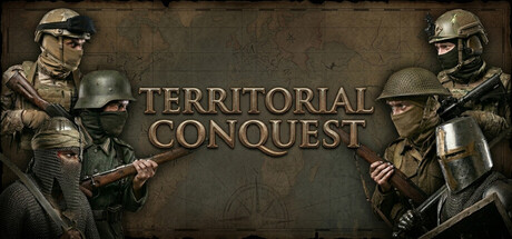
Lead your nation in Territorial Conquest through the Middle Ages, WWII, and Modern Era. Expand borders, build armies, trade, sabotage enemies, make political decisions, and conquer the world in immersive real-time strategy.
$4.99Mixed(20)
StrategyGrand StrategyRTS
Uğur CANMar 28, 2026