Scoring genre clarity...

Not Raised By Wolves capsule

Not Raised By Wolves

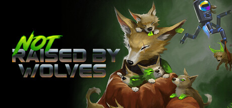
Not Raised by Wolves is a third-person shooter starring La Coyota, an anthropomorphic gunslinger. Dash, aim, and shoot with your revolver while your robotic sidekick hacks enemies to stun them and expose weak points in your fight to rescue the colony’s pups.

Free to PlayVery Positive(85)
ActionShooter3D
Vancouver Film SchoolOct 1, 2025

Not Raised By Wolves scores 65/100 — better than 9% of Action capsules (n=8,534).

Very Positive (85 reviews) · Free to Play · Released Oct 1, 2025 · By Vancouver Film School

Quick text summary

Not Raised By Wolves scored 65/100 on Steam Analyzer — Solid for a Action capsule. Top priority fix: [genre_clarity] Introduce dynamic action pose or gunfire effect to communicate third-person shooter intensity and hacking mechanic interaction

Capsule scores by dimension

  • Genre Clarity: 7/10 — Clear action shooter with character. The anthropomorphic coyote protagonist in a gunslinger pose with visible revolver and robotic sidekick clearly communicate third-person action-shooter gameplay. At tiny size, the character silhouette and weapon remain identifiable, though the specific 'hacking sidekick' mechanic is not visually evident from the capsule alone.
  • Title Readability: 6/10 — Readable but inconsistent weight. The title 'NOT RAISED BY WOLVES' uses bright lime green for 'NOT' and metallic gray for the remaining words, creating visual separation that aids recognition at full size. At tiny size, the contrast between green and gray text causes slight legibility dips, and the multi-word split reduces cohesion compared to unified typography seen in top benchmarks.
  • Contrast & Color: 7/10 — Solid separation with warm tones. The lime-green title text pops distinctly against the dark teal-green background, and the warm brown fur tones of the coyote and pups create clear silhouettes. At tiny size, the character remains distinguishable from background due to value contrast, though some fine detail in the fur blends slightly into the mid-tone background.
  • Uniqueness & Polish: 6/10 — Competent character but generic scene. La Coyota is a memorable anthropomorphic gunslinger with distinctive design, and the robotic sidekick adds visual interest and hints at the core hacking mechanic. However, the overall composition feels like a character card rather than a dynamic action moment—it lacks the intensity and cinematic storytelling found in HELLDIVERS 2 or Black Myth: Wukong's capsules.
  • Brand Consistency: 6/10 — Recognizable character, limited motifs. La Coyota's distinctive coyote design with the revolver and the robotic companion provide identity cues that should be recognizable across promotional materials. The warm earth-tone palette and green accent establish a consistent visual language, but without seeing the store screenshots, the internal cohesion appears functional rather than striking or iconic.
  • Composition: 7/10 — Clear focal point with good balance. The coyote protagonist occupies the center-right with strong visual weight, while the smaller pups and robot sidekick create supporting elements that guide attention without competing. The composition maintains safe margins at full size and reads effectively at small sizes, though the static pose and lack of action dynamic feel slightly passive compared to benchmark titles.

What works

  • Distinctive character design. La Coyota's anthropomorphic gunslinger silhouette is memorable and immediately communicates the protagonist identity clearly at all sizes.
  • Strong title color contrast. The lime-green 'NOT' text creates excellent pop and contrast against the dark background, aiding rapid recognition during quick scrolls.
  • Clear silhouette hierarchy. The primary character, supporting pups, and robot sidekick create a readable visual hierarchy with the protagonist as the dominant focal point.

What hurts the capsule

  • Lack of dynamic action. The composition feels like a static character portrait rather than an action-packed moment, missing the cinematic intensity of top-tier third-person shooter capsules.
  • Mixed title weight inconsistency. The split between bright green 'NOT' and metallic gray remaining text creates visual tension that slightly undermines unified brand messaging.
  • Generic background treatment. The soft teal-green gradient background lacks personality and does not establish setting or gameplay context beyond basic color harmony.

Priority fixes

  1. [genre_clarity] Introduce dynamic action pose or gunfire effect to communicate third-person shooter intensity and hacking mechanic interaction
  2. [uniqueness_polish] Add atmospheric lighting or environmental storytelling element that hints at the colony rescue narrative or gameplay stakes
  3. [title_readability] Unify title typography with consistent weight and single accent color to strengthen brand identity and tiny-size legibility
  4. [composition] Incorporate background scenery or UI elements that reinforce the free-to-play action-shooter context and gameplay environment

Store copy priority fixes

  1. [uniqueness] Replace the student project disclosure with a hook that highlights what makes La Coyota's revolver + drone combo tactically unique (e.g., 'Master the interplay between quick-draw reflexes and tactical hacking—only in Not Raised by Wolves').
  2. [feature_communication] Expand 'dual firing modes' with concrete examples (e.g., 'Switch between rapid-fire and charged shots') so players understand the mechanical depth without ambiguity.
  3. [audience_targeting] Explicitly position the ~10 minute runtime as a strength for solo players with limited time, not a limitation (e.g., 'Tight 10-minute campaign perfect for action lovers between matches').
  4. [uniqueness] Add a sentence that articulates a core differentiator (e.g., how the drone mechanic rewrites the risk-reward of solo play, or how this shooter's pacing and enemy design diverge from competitors).

Related guides

Steam app ID: 4008720 · Tags: Action, Shooter, 3D, Third Person, Futuristic