Scoring genre clarity...

Don't look back capsule

Don't look back

You must walk through dark alleys, lightless fields, and pitch-black forests. There are no monsters chasing you. But never look back. A psychological horror experienced only with the mouse and W, A, S, D.

$1.11Mixed(11)
SingleplayerFirst-PersonHorror
Spaced OutSep 25, 2025

Don't look back scores 73/100 — better than 56% of Singleplayer capsules (n=16,133).

Mixed (11 reviews) · $1.11 · Released Sep 25, 2025 · By Spaced Out

Quick text summary

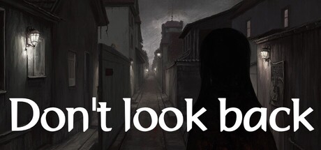
Don't look back scored 73/100 on Steam Analyzer — Good for a Singleplayer capsule. Top priority fix: [genre_clarity] Introduce a visual cue that hints at the core mechanic—such as a subtle backward-turned head silhouette or an eye symbol—to differentiate from generic dark horror and communicate the unique constraint.

Capsule scores by dimension

  • Genre Clarity: 7/10 — Psychological horror tension clear. The dark urban alley setting with moody lighting immediately signals horror atmosphere. The silhouette of a figure in an oppressive narrow street communicates dread and vulnerability, though the specific "don't look back" mechanic is not visually evident at any size. At TINY size, the dark buildings and atmospheric fog remain readable as horror, though fine details dissolve.
  • Title Readability: 9/10 — Bold white text perfectly legible. Large white sans-serif text "Don't look back" is placed in the lower third on a relatively clear dark background, creating excellent contrast against the #1b2838 Steam background. The letterforms remain sharp and fully readable at TINY size (120x45), with no decorative elements that would cause collapse. Strategic positioning avoids competition with the atmospheric scenery above.
  • Contrast & Color: 8/10 — Strong value separation achieved. White title text pops dramatically against the dark scene, and the street lamps create bright focal points that guide attention within the moody grayscale environment. The grayscale composition naturally enhances silhouette separation and value contrast. At SMALL size, the distinction between foreground figure, mid-tone buildings, and dark sky remains clear without muddy blending.
  • Uniqueness & Polish: 7/10 — Atmospheric mood effective but familiar. The cinematic dark alley aesthetic is well-executed with proper lighting and fog effects that convey psychological tension effectively. However, this visual approach—dark urban horror setting—is a recognized trope in the horror genre and doesn't immediately communicate the game's unique constraint mechanic (first-person mouse/keyboard limitation, forbidden backward glance). The capsule succeeds on mood rather than distinctive mechanical hook.
  • Brand Consistency: 6/10 — Minimal branding, establishes tone. The capsule establishes a consistent dark, atmospheric visual identity that should carry through the game's store presence. Without visible logos, character archetypes, or signature motifs, there are limited internal identity cues beyond the monochromatic horror mood. Consistency is baseline—the dark alley setting is coherent but not memorable or iconic enough to create instant brand recognition on repeat viewings.
  • Composition: 7/10 — Clear hierarchy, effective layout. The atmospheric scenery occupies the top two-thirds as background context, while the title anchors the lower third with strong visual weight. A lone figure in the center-left mid-ground creates a clear focal point that draws initial attention before the eye settles on the title. At SMALL and TINY sizes, this hierarchy collapses cleanly to just dark alley + legible text, maintaining readability without excessive clutter or edge-hugging elements.

What works

  • Title legibility at all sizes. White sans-serif text remains sharp and fully readable at TINY size with excellent contrast against dark background, ensuring discoverability during quick Steam scrolls.
  • Atmospheric mood consistency. The monochromatic dark alley with strategic lamp lighting creates a cohesive psychological horror tone that immediately signals genre and emotional intent.
  • Simple, uncluttered composition. Clear separation of background scenery and title prevents visual chaos, allowing the eye to land on text quickly without competing focal points.

What hurts the capsule

  • No mechanical hook visibility. The capsule communicates psychological horror mood but does not visually hint at the core unique mechanic (forbidden backward glance, mouse-only controls) that differentiates the game.
  • Generic horror setting. Dark urban alleys with atmospheric fog are a well-worn horror visual language; the capsule does not establish a distinctive visual identity or memorable icon that competitors like Hades II or Dredge offer.
  • Limited brand recognition anchors. Absence of character, logo, or signature palette makes it harder for returning players to instantly identify the game on a crowded storefront.

Priority fixes

  1. [genre_clarity] Introduce a visual cue that hints at the core mechanic—such as a subtle backward-turned head silhouette or an eye symbol—to differentiate from generic dark horror and communicate the unique constraint.
  2. [uniqueness_polish] Add a signature visual motif or color accent (e.g., a faint eye symbol, red glint, or distinctive light effect) that can serve as a recognizable brand anchor across marketing materials.
  3. [brand_consistency] Reference the 5 store screenshots to identify and reinforce any recurring visual or symbolic elements (character appearance, specific environment details) that could strengthen the capsule's iconic identity.

Store copy priority fixes

  1. [feature_communication] After 'never look back,' add 1–2 sentences explaining what happens when the player walks forward: Do sounds follow them? Do shadows move at the edge of vision? What is the nature of the thing they must not face?
  2. [hook_strength] Trim the final sentence of the short description or move control instructions to a separate line so the hook ends on 'never look back' or the psychological tension, not technical specs.
  3. [uniqueness] Add a sentence contrasting this approach to traditional horror: 'Unlike jump-scare games, your fear comes from what you *don't* see' or similar.

Related guides

Steam app ID: 4009900 · Tags: Singleplayer, First-Person, Horror, Walking Simulator, Dark