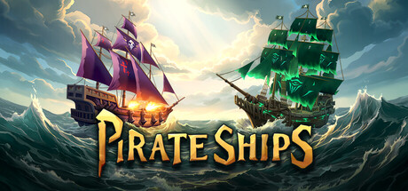
Pirate Ships scores 85/100 — better than 99% of Auto Battler capsules (n=469).

Quick text summary

Pirate Ships scored 85/100 on Steam Analyzer — Excellent for a Auto Battler capsule. Top priority fix: [brand_consistency] Introduce a signature emblematic symbol or recurring character motif that appears across all store assets to increase brand recognition and memorability.

Capsule scores by dimension

  • Genre Clarity: 9/10 — Pirate naval combat immediately clear. Two distinct pirate ships with glowing magical effects centered in epic ocean setting with mountain backdrop communicate naval PvP combat instantly. At tiny size, the ship silhouettes, contrasting purple and green glow, and ocean environment remain unmistakably pirate-themed naval gameplay. Genre expectation of strategy-based ship combat is strongly reinforced by the dynamic ship positioning and fantastical visual elements.
  • Title Readability: 9/10 — Bold gold text reads perfectly small. The title 'PIRATE SHIPS' uses strong golden-yellow lettering with dark outline placed horizontally across the lower third on a cleared background region. At small and tiny sizes, the letterforms remain crisp and legible with excellent contrast against the sky gradient, and the outline prevents collapse even at minimal scale. Strategic placement avoids the busy ship details above.
  • Contrast & Color: 9/10 — Vibrant ship glow pops distinctly. The purple and green glowing effects on the two ships create strong value separation against the blue-gray ocean and sky background. At tiny size, the warm golden title and saturated neon ship glows maintain clear silhouettes and avoid muddy mid-tones. The bright sky area and darker water create layered depth that reads even under quick scroll.
  • Uniqueness & Polish: 8/10 — Polished fantasy pirate aesthetic distinctive. The glowing magical effects on the ships elevate the design beyond generic pirate imagery, suggesting a fantastical or supernatural dimension to naval combat. Clean rendering of the ship details, volumetric lighting in the sky, and atmospheric mountain setting convey premium production value. The visual storytelling hints at PvP competition and progression without feeling templated, though the core composition is fairly traditional for pirate genre work.
  • Brand Consistency: 7/10 — Cohesive pirate theme with magic flair. The internal color palette of purples, greens, golds, and blues maintains consistent rendering across both ship designs and environment. The magical glow effects establish a signature visual identity that differentiates the game from standard historical pirates. However, without reference to other brand materials, it is difficult to assess whether unique identity cues or character motifs are consistently applied across store assets.
  • Composition: 9/10 — Balanced focal point with clear hierarchy. The two ships are positioned symmetrically with the title anchored below as a strong secondary element, creating natural visual hierarchy that works at all sizes. The sky occupies roughly the upper half with mountains framing the sides, creating safe margins and balanced depth. At small and tiny sizes, the primary focal point remains the glowing ships while the title stays readable and separate, with no edge hugging or cropping concerns.

What works

  • Strong genre clarity through visual iconography. Pirate ships, ocean setting, and magical glow effects communicate naval PvP gameplay instantly at any size.
  • Excellent title contrast and legibility. Golden-yellow text with dark outline remains perfectly readable at tiny size against the sky background.
  • Premium magical atmosphere. Neon glowing effects on ships elevate the design beyond generic pirate imagery and suggest fantastical gameplay.
  • Clean balanced composition. Symmetrical ship arrangement with safe margins and clear depth layering maintains strong focal point across all viewing sizes.

What hurts the capsule

  • Limited identity differentiation. While cohesive, the design does not feature a signature character, emblem, or motif that would be distinctly memorable across brand touchpoints.
  • Generic pirate theme execution. The core concept of glowing ships in ocean setting, while well-executed, follows familiar fantasy pirate visual conventions without a unique hook.

Priority fixes

  1. [brand_consistency] Introduce a signature emblematic symbol or recurring character motif that appears across all store assets to increase brand recognition and memorability.
  2. [uniqueness_polish] Consider adding a subtle gameplay mechanic visual hint (such as UI elements, crew silhouettes, or resource indicators) that communicates the shipbuilding and strategy depth beyond pure naval aesthetics.

Store copy priority fixes

  1. [genre_clarity] Add one sentence explicitly stating the combat style: 'Command your crew in turn-based auto-battler naval combat' or clarify real-time vs strategic timing.
  2. [uniqueness] Insert a differentiation statement early in the detailed description: 'Unlike traditional PvP games, every ship is built and customized by players, meaning no two battles are the same' or similar unique hook.
  3. [feature_communication] Replace vague marketing adjectives with concrete gameplay examples: instead of 'Make unique combinations', write 'Combine cannon types, crew abilities, and hull upgrades to counter opponent builds'.
  4. [hook_strength] Rewrite the short description to lead with a concrete gameplay hook: 'Build a custom warship and test it against real players in tactical naval battles' rather than relying on 'epic journey' framing.

Related guides

Steam app ID: 4011110 · Tags: Auto Battler, Roguelike, Pirates, Turn-Based Combat, Sailing