Two Tired to Mountain scores 75/100 — better than 70% of Action capsules (n=8,534).

Quick text summary

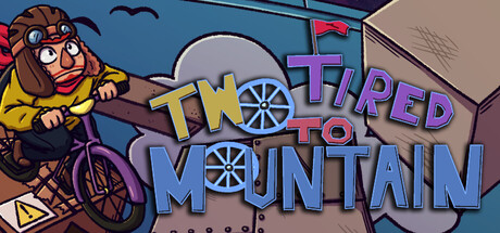
Two Tired to Mountain scored 75/100 on Steam Analyzer — Good for a Action capsule. Top priority fix: [title_readability] Add a subtle dark outline or background panel behind the title text to increase legibility and crispness at tiny sizes without losing the gradient effect

Capsule scores by dimension

  • Genre Clarity: 8/10 — Clear action platformer identity. The bicycle-riding character in a yellow jacket against a frozen mountain setting with dynamic composition immediately signals an action platformer. The cartoonish art style and momentum-focused visual language (character leaning into motion) effectively communicate the core mechanic. At tiny size, the character silhouette and bike remain recognizable, clearly establishing the action platformer genre.
  • Title Readability: 7/10 — Readable with minor size concerns. The title 'TWO TIRED TO MOUNTAIN' uses bold, colorful lettering with good contrast against the mid-tone background. At full and small sizes it reads clearly with the yellow and blue gradient letters. At tiny size, letter forms remain distinguishable but the playful pun becomes harder to parse, and the gradient decoration slightly reduces crispness at minimal resolution.
  • Contrast & Color: 8/10 — Strong value separation, vibrant palette. The design uses high-saturation yellows, purples, and blues that pop distinctly against the dark Steam background and blue sky. The character's yellow jacket creates strong silhouette separation from the building and sky. The bright wheel details and title colors maintain clarity even at small size, with good light-dark contrast throughout the composition.
  • Uniqueness & Polish: 7/10 — Charming indie style, solid craft. The hand-drawn cartoon art direction with expressive character design and playful title pun ('Two Tired') shows distinctive personality beyond generic action game templates. Clean outlines, consistent rendering, and cohesive color choices demonstrate intentional craft. However, the visual concept of a character on a bike climbing a mountain, while well-executed, doesn't introduce a groundbreaking visual hook compared to standout indie successes.
  • Brand Consistency: 7/10 — Consistent cartoon aesthetic throughout. The capsule maintains a unified cartoonish hand-drawn style with consistent line work, color palette, and character expressiveness that should align with in-game visuals. The bicycle and character design appear recognizable as iconic elements that could serve as brand identity. The vibrant primary color scheme (yellow, blue, purple) creates a memorable visual signature consistent with indie action games.
  • Composition: 8/10 — Well-balanced focal hierarchy. The character on the left serves as the primary focal point with strong visual weight, while the mountain building and title balance on the right, creating a dynamic diagonal read. Layering works effectively with character in foreground, building in midground, and sky in background. At small and tiny sizes, the composition remains clear with no critical elements lost, though the building detail becomes less distinct at minimal resolution.

What works

  • Vibrant color contrast. Yellow, blue, and purple elements create excellent separation against the dark Steam background and each other, maintaining visibility at all sizes.
  • Playful brand personality. The 'Two Tired' pun and expressive character convey distinctive charm and indie sensibility that differentiates it from generic action titles.
  • Clear primary subject. The character and bicycle form an immediately recognizable focal point that communicates the core gameplay mechanic without ambiguity.

What hurts the capsule

  • Title hierarchy clarity at tiny. The gradient-styled lettering, while visually interesting, loses some crispness at minimal resolution and the pun wordplay becomes harder to parse quickly.
  • Building detail murkiness. The architectural structure on the right uses muted blues and grays that blend somewhat into the background, reducing visual separation at small sizes.
  • Generic premise presentation. While well-executed, the 'character climbing mountain' concept doesn't visually communicate unique mechanics like momentum physics or rage mechanics that differentiate the game.

Priority fixes

  1. [title_readability] Add a subtle dark outline or background panel behind the title text to increase legibility and crispness at tiny sizes without losing the gradient effect
  2. [contrast_color] Increase the value separation of the mountain building structure with stronger highlights or cooler shadows to make it pop from the background sky
  3. [genre_clarity] Consider adding a subtle visual element that hints at the momentum or rage mechanic, such as motion trails or an angry expression, to better communicate core gameplay

Store copy priority fixes

  1. [hook_strength] Remove or rework the final three paragraphs starting with 'It's up to you to gear up' so the copy ends on the strong feature/mechanics note instead of veering into vague existential narrative that dilutes the comedic tone.
  2. [tone_match] Replace the all-caps closing lines ('A LIFE OF ACHIEVEMENT...', 'GO FORTH AND BECOME...') with language that matches the witty, conversational voice of the opening, or delete them entirely and let the feature list be the final impression.
  3. [feature_communication] Clarify the difficulty curve or expected playtime in the feature breakdown (e.g., 'designed to challenge both casual and hardcore platformer fans') to better set player expectations against the 'enrage and evolve' language.

Related guides

Steam app ID: 4012120 · Tags: Action, Platformer, 2D Platformer, Exploration, Precision Platformer