Scoring genre clarity...
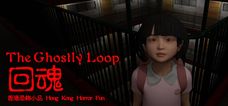
"Well-shaped" public housing is a historic Hong Kong icon.The Ghostly Loop, a first-person game, immerses players in a Hong Kong housing estate to interact with residents and escape.Each floor and character has a unique story, showcasing Hong Kong’s culture.
$9.994 user reviews
ActionAdventureSimulation
Hong Kong Horror FunNov 26, 2025