Scoring genre clarity...

Tetro Runner capsule

Tetro Runner

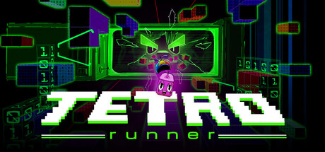
Tetro Runner is an arcade platformer about a sentient block trying to escape a collapsed and corrupt arcade cabinet. You must juggle fast paced platforming and precise block placement to stay alive and get the highest score you can.

$9.995 user reviews
ActionArcadeFalling Blocks
Rollmop Games StudioMar 4, 2026

Tetro Runner scores 83/100 — better than 96% of Action capsules (n=8,534).

5 user reviews · $9.99 · Released Mar 4, 2026 · By Rollmop Games Studio

Quick text summary

Tetro Runner scored 83/100 on Steam Analyzer — Good for a Action capsule. Top priority fix: [uniqueness_polish] Emphasize the sentient block character more prominently or add a distinctive visual signature that sets this apart from general retro-arcade games—currently the purple pyramid is the only unique element.

Capsule scores by dimension

  • Genre Clarity: 8/10 — Arcade platformer identity clear. The neon green geometric shapes, pixelated block character, and arcade cabinet framing immediately communicate retro arcade action. The glowing UI elements and fast-paced visual language read as action-platformer at all sizes, though 'runner' specificity becomes clearer at full size. At TINY size, the neon aesthetic and block motif alone signal arcade/action genre without ambiguity.
  • Title Readability: 9/10 — Bold white typography excellent. TETRO RUNNER displays in thick, high-contrast white sans-serif text positioned prominently in the lower half against the dark neon background, maintaining perfect legibility at FULL, SMALL, and TINY sizes. The chunky letterforms and clean outline resist collapse and remain instantly recognizable even at thumbnail scale. The 'runner' subtitle reinforces the title without creating visual noise.
  • Contrast & Color: 9/10 — Vibrant neon pops dramatically. Bright lime green and magenta neon elements contrast sharply against the pure black background, creating strong value separation that reads clearly at all scales and survives grayscale conversion. The white title text sits atop dark areas, ensuring primary readability, while the purple/magenta glowing cabinet and green geometric shapes provide secondary visual pop. Even at TINY size, the neon silhouettes remain distinct and vibrant against #1b2838.
  • Uniqueness & Polish: 8/10 — Distinctive arcade cabinet aesthetic. The design combines recognizable Tetris visual language with arcade CRT aesthetics, creating a cohesive retro-futuristic identity that feels intentional and polished rather than generic. The glitched/corrupted purple pyramid floating above the cabinet and the detailed neon wireframe architecture show craft and storytelling alignment with the game's 'corrupt arcade' narrative. The execution avoids template feel and demonstrates clear art direction, though the concept itself borrows familiar retro-arcade tropes.
  • Brand Consistency: 8/10 — Cohesive neon arcade identity. The lime green and magenta color palette, geometric block shapes, and CRT cabinet rendering create a recognizable visual signature consistent with arcade platformer brand expectations. Neon wireframe style, glitched elements, and pixelated typography all reinforce a unified aesthetic that would carry across marketing materials and screenshots. The internal palette, rendering approach, and thematic motifs (blocks, arcade cabinet, corruption effects) show strong internal coherence without generic copying.
  • Composition: 8/10 — Clear hierarchy with strong focus. The arcade cabinet occupies the upper center with the glowing pyramid anomaly as the focal point, while the bold title anchors the lower third, creating natural top-to-bottom flow. The composition uses depth layering—background wireframe grid, midground cabinet structure, foreground neon elements—to establish hierarchy that reads at all sizes. Safe margins protect the title, and the design remains visually balanced without dead space or edge-hugging issues that would cause Steam cropping problems.

What works

  • Exceptional title legibility at all sizes. TETRO RUNNER maintains perfect readability from FULL down to TINY through thick white letterforms and strategic dark background placement.
  • Strong neon contrast pop. Lime green and magenta elements create vibrant silhouettes that remain distinct even at thumbnail scale and survive grayscale evaluation.
  • Cohesive art direction and narrative. The corrupted arcade cabinet with glitched pyramid communicates the game's core premise while maintaining consistent visual language throughout.
  • Clear genre communication. Arcade platformer identity is unmistakable through block motifs, neon aesthetics, cabinet framing, and retro-action visual language at all viewing scales.

What hurts the capsule

  • Potentially generic retro-arcade trope. While well-executed, the neon arcade cabinet aesthetic borrows heavily from established retro-game visual conventions without a unique visual hook beyond the purple glitch effect.
  • Busy upper composition at full size. The wireframe grid and stacked geometric elements above the cabinet create visual noise that, while thematic, could potentially distract from the block character focal point.

Priority fixes

  1. [uniqueness_polish] Emphasize the sentient block character more prominently or add a distinctive visual signature that sets this apart from general retro-arcade games—currently the purple pyramid is the only unique element.

Store copy priority fixes

  1. [feature_communication] Expand the block placement mechanic explanation: replace "combining them correctly for score explosions" with a concrete example like "strategically place blocks to create paths up, eliminate enemies, and complete line clears for massive score bonuses."
  2. [uniqueness] Add 1-2 sentences explaining what makes the block-placement hybrid mechanic distinct: "Unlike traditional runners, you must actively decide where each falling block goes—sacrifice horizontal progress to clear enemies, or save blocks for safe path-building."
  3. [feature_communication] Briefly explain the asymmetric co-op mode in the main copy: add 1 sentence like "In local co-op, one player controls the running block while the other strategically places incoming blocks to help—or challenge—their partner."
  4. [feature_communication] Clarify the modifiers system with an example: change "13 Unique Run Modifiers" to "13 Unique Run Modifiers (e.g., faster corruption speed, tougher enemies, higher score multipliers) stackable for endless challenge combinations."

Related guides

Steam app ID: 4015160 · Tags: Action, Arcade, Falling Blocks, Local Co-Op, Runner