Scoring genre clarity...

Pairvo capsule

Pairvo

A minimalist card matching game where you memorize playing cards, create combos, and chase high scores through increasingly difficult phases.

$1.99
Card GameStrategyIndie
Fat Cat InteractiveMay 8, 2026

Pairvo scores 73/100 — better than 55% of Card Game capsules (n=1,019).

$1.99 · Released May 8, 2026 · By Fat Cat Interactive

Quick text summary

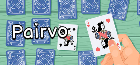
Pairvo scored 73/100 on Steam Analyzer — Good for a Card Game capsule. Top priority fix: [brand_consistency] Add a distinctive game logo or icon element that can become the brand's recognizable symbol across all marketing materials.

Capsule scores by dimension

  • Genre Clarity: 8/10 — Card game mechanic clearly visible. The capsule immediately communicates a card matching game through the prominent playing cards displayed across the composition, with blue card backs and a visible Queen card in the foreground. The hand holding a card and the green felt surface reinforce the card game genre unambiguously. At TINY size, the card silhouettes and hand gesture remain readable and genre-identifying.
  • Title Readability: 7/10 — Clear but slightly tight spacing. The title 'Pairvo' uses white letters with a black outline, positioned in the upper-left area over relatively clean space. The text reads well at FULL and SMALL sizes with adequate contrast, though at TINY size the letter spacing becomes slightly compressed and the outline thickness could be marginally more prominent for maximum clarity.
  • Contrast & Color: 8/10 — Strong value separation and saturation. The bright mint-green felt background creates excellent contrast against the deep blue card backs and white title text, popping clearly against the Steam dark background. The warm orange and pink accents in the heart and Queen card provide additional color separation. Silhouettes remain clear even when squinting, with the hand and cards reading distinctly at all sizes.
  • Uniqueness & Polish: 7/10 — Competent execution with genre-standard visuals. The design shows clean craft with intentional color choices and clear card game iconography, but the composition relies on familiar card game visual tropes without a distinctive art style or unique hook that separates it from other card-based games. The hand gesture and felt table are well-rendered but do not communicate a unique mechanic or selling point beyond 'card matching game.'
  • Brand Consistency: 6/10 — Minimal identity cues present. The capsule establishes a card game aesthetic consistently but lacks memorable branded elements like a distinctive character, icon, or signature visual motif that would be immediately recognizable in subsequent materials. The color palette is cohesive internally (blue, green, warm accents) but does not establish a unique identity signal beyond the generic card game theme.
  • Composition: 8/10 — Balanced layout with clear focal point. The composition layers background card backs, mid-ground felt surface, and foreground hand holding the Queen card, creating good depth hierarchy. The primary focal point (Queen card and hand) sits naturally off-center without dead-space voids, and the scattered supporting cards guide the eye without competing. Safe margins appear adequate, though the top-left corner title placement could face minor Steam crop risk depending on platform.

What works

  • Immediate genre recognition. Multiple playing cards, felt surface, and hand interaction instantly communicate this is a card matching game with no ambiguity.
  • Strong color pop against dark background. Mint-green and deep blue create high-value contrast that reads clearly at small thumbnail size and holds up well in grayscale squint test.
  • Clean visual hierarchy and layering. Background cards, mid-ground surface, and foreground hand create effective depth that keeps the eye moving without scattered attention.
  • Readable white title with outline. The 'Pairvo' text maintains legibility across FULL, SMALL, and TINY sizes thanks to the black outline and strategic placement on relatively clean space.

What hurts the capsule

  • Generic brand identity. The capsule lacks a distinctive character, mascot, or signature visual element that would make Pairvo recognizable beyond its genre category.
  • Standard card game visual language. The composition relies heavily on familiar playing card aesthetics and felt table tropes common to many card games, offering no unique art style or mechanic reveal.
  • Minimal unique selling proposition visual. The capsule does not communicate what makes Pairvo different from other card matching games, such as combo mechanics or progression phases mentioned in the description.

Priority fixes

  1. [brand_consistency] Add a distinctive game logo or icon element that can become the brand's recognizable symbol across all marketing materials.
  2. [uniqueness_polish] Introduce a visual element that hints at a core mechanic like combo building or difficulty escalation, such as stacked cards or glowing effects.
  3. [title_readability] Increase outline thickness slightly and test at 120x45 pixel thumbnail to ensure letter forms remain crisp without blur.

Store copy priority fixes

  1. [uniqueness] Add a specific differentiator in the short description: e.g., 'memorize and match cards in real-time rhythm gameplay' or name a unique mechanic that sets Pairvo apart from Memory/Pairs clones.
  2. [feature_communication] Include at least one concrete example of gameplay: e.g., 'match pairs of cards to build combos that multiply your score as the board shuffles faster' to show what 'matches' and 'combos' actually feel like.
  3. [hook_strength] Rewrite the opening to lead with emotional payoff or flow state: e.g., 'Enter a trance-like rhythm of perfect matches where every card flip builds momentum and pushes you to chase your highest score yet.'

Related guides

Steam app ID: 4016210 · Tags: Card Game, Strategy, Indie, Deckbuilding, Singleplayer