Scoring genre clarity...
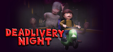
Deliver food through a city hunted by a serial killer. Deadlivery Night blends fast-paced arcade driving with survival horror as you complete deliveries, escape danger, meet strange characters, and uncover a world of cosmic conspiracies!
$9.996 user reviews
IndieRetroSurvival Horror
Bucefalo GamesApr 21, 2026