Scoring genre clarity...
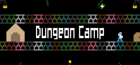
Pops is “The World’s Best Camper”. But there is one destination he has yet to pitch his tent… Help Pops carry his tent through a variety of platforming challenges and be the first to journey to the end of The Abandoned Dungeon to setup for the most remote camping trip!
$4.994 user reviews
Precision PlatformerSide ScrollerAdventure
Pincushion GamesDec 12, 2025