Scoring genre clarity...

Pawffice capsule

Pawffice

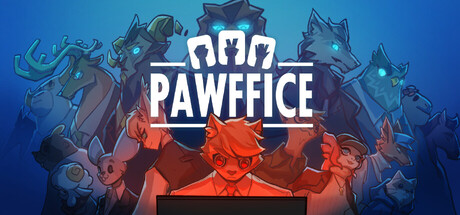
Pawffice is a story-driven, strategy roguelike game. Coon, an average college grad. He has to use his unique ability, "Rock-Paper-Scissors" to defeat all sorts of strange enemies. After countless do-overs , can he save himself and his friends, and uncover all the secrets behind Pawffice?

$11.99Positive(33)
RogueliteRoguelikeRPG
飞天海牛工作室Feb 13, 2026

Pawffice scores 75/100 — better than 68% of Roguelite capsules (n=2,290).

Positive (33 reviews) · $11.99 · Released Feb 13, 2026 · By 飞天海牛工作室

Quick text summary

Pawffice scored 75/100 on Steam Analyzer — Good for a Roguelite capsule. Top priority fix: [genre_clarity] Emphasize or clarify the Rock-Paper-Scissors mechanic more prominently—consider animating the shield symbols or making them larger and more distinct at small sizes to communicate the core gameplay loop immediately.

Capsule scores by dimension

  • Genre Clarity: 7/10 — Strategy roguelike with character focus clear. The capsule effectively signals strategy and RPG through the Rock-Paper-Scissors iconography (shield symbols at top) and the central character pose suggesting decision-making gameplay. At TINY size, the blue-to-red gradient with character silhouettes and icon elements reads as indie strategy, though the specific roguelike mechanics aren't obvious without additional context. The anthropomorphic protagonist and stylized enemies support indie adventure positioning well.
  • Title Readability: 8/10 — Bold white title reads strongly at all sizes. PAWFFICE is rendered in large, clean white sans-serif type with strong contrast against the blue gradient background and positioned prominently above the character art. The title remains clearly legible at SMALL and TINY sizes due to generous letter spacing and thick letter weight. However, the shield icons framing the text add decorative detail that doesn't impair readability but competes slightly for attention.
  • Contrast & Color: 8/10 — Strong value separation with warm-cool interplay. The design uses a cool blue gradient background (#1b2838 adjacent) against warm orange-red character elements and crisp white title, creating excellent silhouette separation. At TINY size, the character forms remain distinct and the color blocks read cleanly. The grayscale test shows good value range from dark blue midtones to bright white and warm orange highlights, ensuring clarity even without color.
  • Uniqueness & Polish: 7/10 — Distinctive character art with polished execution. The stylized anthropomorphic character designs and Rock-Paper-Scissors mechanic iconography provide a memorable hook that differentiates from generic strategy games. The illustration quality is clean and intentional, with coherent shading and readable silhouettes. However, the overall composition feels more conventional indie game aesthetic than standout premium polish; it executes the brief well but doesn't push beyond expected craft for the genre.
  • Brand Consistency: 7/10 — Cohesive art style with recognizable identity. The capsule establishes a consistent stylized illustration approach with the character designs, color palette (cool blues grounding warm orange accents), and the RPS shield motif suggesting core mechanics. The visual direction feels coherent and would likely be recognizable across marketing materials. Internal consistency is strong, though the brand identity signals rely heavily on character design rather than a truly iconic motif or symbol.
  • Composition: 8/10 — Clear hierarchy with centered focal point. The composition uses strong depth layering: background characters top, large central protagonist in warm tones, and title anchored above, creating a clear visual hierarchy. The eye naturally settles on the character group at center, with the white title providing secondary anchor. At SMALL and TINY sizes, the focal point remains strong and uncluttered; the design has good resilience to cropping due to centered placement away from edges.

What works

  • Excellent title contrast and legibility. White bold sans-serif PAWFFICE reads cleanly at all viewing sizes against the blue gradient, with clear letterforms and strategic placement in prime real estate.
  • Strong visual hierarchy and focal point. The central character grouping immediately draws attention, with supporting elements (title, icons) guiding rather than competing, maintaining clarity at TINY size.
  • Warm-cool color interplay creates separation. Orange-red characters against cool blue background and Steam's dark background ensure strong silhouette definition and value contrast in grayscale.
  • Cohesive stylized art direction. Consistent illustration style across characters and design elements builds recognizable brand identity with intentional, polished execution.

What hurts the capsule

  • Genre signals could be more explicit. While the RPS shield icons hint at core mechanics, the strategy roguelike nature isn't immediately obvious at TINY size without prior knowledge.
  • Generic indie game aesthetic. Despite solid execution, the overall visual approach doesn't clearly differentiate from typical indie strategy releases or push beyond expected genre conventions.
  • Brand identity relies heavily on character design. The memorable visual hook centers on anthropomorphic characters rather than an iconic symbol or unique visual motif that could stand alone.

Priority fixes

  1. [genre_clarity] Emphasize or clarify the Rock-Paper-Scissors mechanic more prominently—consider animating the shield symbols or making them larger and more distinct at small sizes to communicate the core gameplay loop immediately.
  2. [uniqueness_polish] Develop a signature visual motif or color accent pattern that becomes instantly recognizable and differentiates Pawffice from comparable indie strategy titles in thumbnail view.
  3. [brand_consistency] Ensure the RPS shield iconography and primary character design appear consistently in all promotional materials to build stronger visual brand recognition across the Steam store.

Store copy priority fixes

  1. [hook_strength] Remove the developer introduction and replace the opening line with the narrative hook: "Pawffice is a story-driven roguelike where every run unravels a darker truth. Armed with Rock-Paper-Scissors powers, an average college grad must escape a twisted corporate game—if he can survive that long." This immediately grounds genre, mood, and mystery.
  2. [feature_communication] Add a single sentence explaining what rings, strategies, and artifacts do: e.g., "Combine 14 unique rings with 17 tactical strategies and 24 powerful artifacts to master turn-based Rock-Paper-Scissors combat and unlock new dialogue paths." This transforms raw numbers into meaningful systems.
  3. [tone_match] Separate the Early Access thank-you message into a changelog-style bullet list at the bottom, and rewrite the main body to adopt a consistent dark-humored, narrative-first tone that matches the atmospheric workplace-horror premise.
  4. [audience_targeting] Add a one-sentence audience clarification such as: "For players who crave witty, dialogue-heavy narratives with meaningful strategic choice" to signal that this is story-first and clarify the mature, indie-savvy demographic.

Related guides

Steam app ID: 4021230 · Tags: Roguelite, Roguelike, RPG, Story Rich, Atmospheric