Scoring genre clarity...
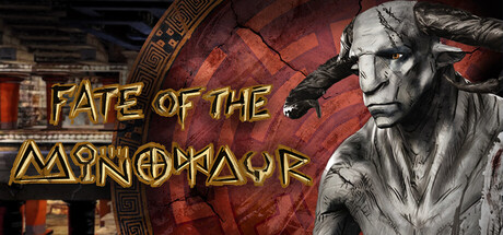
Within this narrative VR experience FATE OF THE MINOTAUR, players descend into the mythical labyrinth, learn about the Minotaur’s tragic story and confront him to escape.
Free to Play5 user reviews
ActionAdventureAction-Adventure
Filmakademie Baden-Wuerttemberg, AnimationsinstitutDec 10, 2025