Scoring genre clarity...

Penelope Syndrome capsule

Penelope Syndrome

You are not a hero. You are just an everyday average mechanic. You can fight, but without having the resources to repair damaged systems blocking your way, you will die before you escape...

$4.994 user reviews
ActionAdventureSurvival Horror
CritoniuumOct 27, 2025

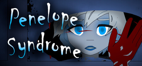
Penelope Syndrome scores 65/100 — better than 9% of Action capsules (n=8,534).

4 user reviews · $4.99 · Released Oct 27, 2025 · By Critoniuum

Quick text summary

Penelope Syndrome scored 65/100 on Steam Analyzer — Solid for a Action capsule. Top priority fix: [title_readability] Switch to a bolder, more geometric sans-serif font or add a darker outline to the current title to maintain legibility at thumbnail size without losing the cyan color identity.

Capsule scores by dimension

  • Genre Clarity: 7/10 — Sci-fi action with ambiguous tone. The robotic female character with glowing blue eyes and red hand gesture reads as sci-fi action, supported by the mechanic narrative. However, at tiny size the character silhouette compresses and the genre intent becomes less clear—it could read as narrative adventure or horror depending on context. The industrial aesthetic and character design do signal action-adventure competently at small size.
  • Title Readability: 6/10 — Readable but stylized, loses clarity tiny. The title 'Penelope Syndrome' uses a handwritten-style cyan and white font with consistent spacing and sits on a dark background with minimal texture interference. At full and small sizes it reads cleanly, but at tiny size the lettering becomes thin and loses distinctiveness, particularly the decorative 'P' character which compresses into ambiguity. The two-line stacked layout helps maintain hierarchy but doesn't solve the scale-down legibility problem.
  • Contrast & Color: 8/10 — Strong silhouette, excellent pop. The bright cyan and white title contrasts sharply against the dark blue-black background, creating clear separation. The character's bright cyan eyes and pale skin stand out distinctly against the shadowed face and background environment. In grayscale, the value separation remains strong, and at tiny size the glowing eyes still read as a focal point, though overall contrast resilience is good but not exceptional.
  • Uniqueness & Polish: 6/10 — Competent anime-style character render. The 3D character model has clean lighting and professional rendering quality with expressive blue eyes and detailed hair. However, the overall composition reads as a standard character portrait with no distinctive visual hook or unique mechanical/thematic storytelling—it's a well-executed but generic presentation of a female character without conveying the 'mechanic' or resource-scarcity tension the game promises. The red gesture is visually interesting but doesn't clarify the unique selling point.
  • Brand Consistency: 5/10 — Limited identity signals, generic presentation. The character design uses standard anime-adjacent aesthetics with no immediately recognizable icon, symbol, or distinctive palette that would anchor brand recall. Without access to the eight store screenshots mentioned, the rendering style appears clean but not uniquely branded—it could belong to multiple indie sci-fi titles. The title font is the strongest identity marker, but it lacks supporting visual motifs that would make this capsule memorable across multiple Steam exposures.
  • Composition: 7/10 — Clear focal point, safe title placement. The character face occupies the right center, creating a strong focal point with the title positioned safely in the upper left above a dark background region. At small and tiny sizes the hierarchy holds: character reads first, title second. The composition avoids dead space and critical elements sit well within safe margins. However, the red hand element on the right edge risks partial crop depending on Steam thumbnail rendering, and the lower half of the frame feels slightly underutilized.

What works

  • Vibrant color pop against dark Steam background. Cyan and white title combined with bright blue character eyes create immediate visual contrast that draws attention in quick scroll.
  • Professional 3D character rendering. The character model shows clean lighting, smooth skin, and expressive eyes with high production polish that signals quality.
  • Safe composition with protected focal point. Face and title placement avoid edge clustering and maintain readable hierarchy across small to full sizes.

What hurts the capsule

  • Title font loses legibility at tiny size. Decorative handwritten styling collapses into visual noise when compressed below small scale, undermining immediate title recognition.
  • No distinctive visual identity or unique hook. Character portrait reads as generic anime-adjacent sci-fi with no memorable motif, symbol, or thematic cue that conveys 'mechanic survival' or resource scarcity tension.
  • Red gesture element sits dangerously close to edge. The right hand element risks Steam crop cutoff depending on thumbnail rendering, and its purpose (emotional state or mechanical cue?) remains unclear.

Priority fixes

  1. [title_readability] Switch to a bolder, more geometric sans-serif font or add a darker outline to the current title to maintain legibility at thumbnail size without losing the cyan color identity.
  2. [uniqueness_polish] Integrate a mechanic-specific visual element (tool, wrench, circuit overlay, or damaged armor plating) into the composition to communicate the core survival-through-repair mechanic and differentiate from generic sci-fi character capsules.
  3. [composition] Move or resize the red hand element further inward to ensure it clears safe crop margins, or replace it with a smaller supporting detail that strengthens the mechanic theme rather than adding ambiguous gesture.

Store copy priority fixes

  1. [feature_communication] Write a detailed description (150–250 words) explaining: (1) the setting and threat environment, (2) what 'repair systems' entails as a mechanic, (3) the survival loop structure, and (4) how combat and resource management interact.
  2. [hook_strength] Expand the short description to 2–3 sentences and add a sensory or atmospheric detail that hints at the psychological horror tone, e.g., 'You are not a hero. You are just an everyday mechanic trapped in [dark place]. Your only tools are a wrench and your wits—and time is running out.'
  3. [genre_clarity] Explicitly name the core gameplay loop in the first paragraph of the detailed description using action verbs (e.g., 'scavenge for parts,' 'battle hostile forces,' 'unlock passages') to clarify the mix of exploration, combat, and puzzle-solving.
  4. [audience_targeting] Add a sentence in the detailed description that addresses player expectations, e.g., 'For players seeking a punishing survival challenge where brute force fails and cunning prevails' or similar.

Related guides

Steam app ID: 4023200 · Tags: Action, Adventure, Survival Horror, Action-Adventure, Dark Fantasy