Scoring genre clarity...

Sprite's City Scramble capsule

Sprite's City Scramble

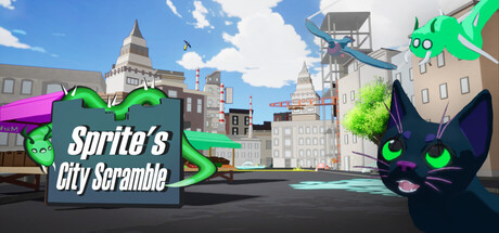
A 3D puzzle-platformer where you play as Sprite, an alien parasite who can possess creatures with unique abilities. Explore, solve puzzles, and collect everyday artifacts to understand our world and find your way home.

Free to Play5 user reviews
AdventureCasualPlatformer
CloudBurst GamesOct 1, 2025

Sprite's City Scramble scores 75/100 — better than 74% of Adventure capsules (n=7,922).

5 user reviews · Free to Play · Released Oct 1, 2025 · By CloudBurst Games

Quick text summary

Sprite's City Scramble scored 75/100 on Steam Analyzer — Good for a Adventure capsule. Top priority fix: [genre_clarity] Add secondary creature silhouettes or visual hints showing different possessed forms to communicate the core possession mechanic and gameplay loop.

Capsule scores by dimension

  • Genre Clarity: 7/10 — Clear casual adventure with quirky charm. The bright, colorful cityscape with the distinctive green alien character (Sprite) immediately signals a casual, whimsical adventure game rather than a serious puzzle-platformer. At tiny size, the green cat-like creature and vibrant environment read as family-friendly indie adventure, though the possession mechanic is not immediately obvious from visuals alone. The architectural setting and playful character design support genre expectations for exploration-based gameplay.
  • Title Readability: 8/10 — White text clearly readable at all sizes. The title 'Sprite's City Scramble' uses bold white text with a dark semi-transparent backing panel on the left side, ensuring strong contrast against the busy background. The text remains legible at small and tiny sizes due to generous spacing and weight, though the tagline positioning could compete slightly at thumbnail scale. Strategic placement on a controlled background region rather than directly over complex scenery enhances clarity.
  • Contrast & Color: 8/10 — Strong vibrancy with clear subject separation. The bright lime-green character pops distinctly against the blue sky and urban grays, creating excellent value separation and silhouette clarity. The neon green accent elements (water spray, UI hints) amplify visual pop and guide attention without overwhelming. At tiny size, the green protagonist remains the dominant focal point with clear edges, though the midtone building details risk slight muddiness in grayscale contrast testing.
  • Uniqueness & Polish: 7/10 — Distinctive character design with polished visuals. The green alien parasite character is a memorable, non-generic hook that differentiates this from standard platformers, and the 3D rendering quality appears clean and professional. The composition tells a story of exploration and urban discovery rather than generic action. However, the cityscape background itself follows familiar visual patterns common in indie adventure games, preventing this from reaching premium distinctiveness—it feels polished but not groundbreaking.
  • Brand Consistency: 7/10 — Cohesive art style with recognizable alien mascot. The green character design, vibrant color palette, and whimsical art direction create a consistent internal identity that could be recognized across marketing materials. The lime-green neon accent color appears intentionally chosen as a brand signifier and appears strategically throughout. The 3D rendering style is clean and uniform, though without reference to other store assets, it's difficult to assess full brand ecosystem consistency.
  • Composition: 8/10 — Well-balanced focal point with clear hierarchy. The green alien character anchors the left-center foreground as the primary focal point, while the cityscape creates depth layering and context in the background. The title panel sits strategically left without obscuring the character, and the composition leverages the urban setting to communicate exploration themes. At small and tiny sizes, the character remains dominant and the eye naturally gravitates to it, though some architectural details in the middle distance create minor visual noise that could be simplified.

What works

  • Strong color contrast and character pop. Lime-green protagonist silhouette stands out clearly against blue sky and gray buildings, maintaining visual dominance even at thumbnail size.
  • Title placement and readability. White text on dark backing ensures legibility across all sizes while avoiding overlap with the main character or busy scene details.
  • Memorable mascot design. The distinctive green alien character is a unique hook that differentiates from generic platformer visuals and provides a recognizable brand anchor.
  • Clear depth and layering. Foreground character, midground cityscape, and background sky create natural visual hierarchy that guides viewer attention logically.

What hurts the capsule

  • Generic urban environment. The cityscape background, while competent, follows familiar indie game visual patterns and doesn't communicate the possession/ability mechanic visually.
  • Moderate midtone density. Building details in the middle distance create visual noise that competes slightly for attention and could muddy contrast when viewed at tiny sizes or in grayscale.
  • Limited gameplay mechanic visibility. The core possession and creature-ability switching mechanic is not visually communicated in the capsule, leaving the unique gameplay premise unclear to new viewers.

Priority fixes

  1. [genre_clarity] Add secondary creature silhouettes or visual hints showing different possessed forms to communicate the core possession mechanic and gameplay loop.
  2. [composition] Simplify or reduce building detail complexity in midground to strengthen contrast separation between foreground character and environmental context.
  3. [uniqueness_polish] Introduce subtle ability indicators or puzzle-solving visual cues that hint at the game's core mechanic beyond simple exploration vibes.

Store copy priority fixes

  1. [feature_communication] Add 1–2 concrete examples of creature abilities and how they solve puzzles: 'Possess a bird to reach high ledges, or a burrowing creature to uncover hidden paths.' This replaces vague phrasing with tangible gameplay moments.
  2. [audience_targeting] Insert playtime estimate and difficulty tier in the short description or opening paragraph: 'A compact 2–3 hour adventure for casual puzzle-platformer fans' or similar, to set realistic expectations for the free-to-play audience.
  3. [hook_strength] Strengthen the emotional pull of the short description by reframing the ending: 'stranded on an alien world' or 'trapped on Earth' instead of neutral 'find your way home' to raise narrative stakes.
  4. [uniqueness] Clarify how many creatures are available and how the possession system creates puzzle variety: 'Swap between 5+ creatures, each unlocking new pathways and puzzle solutions,' to communicate replayability and depth.

Related guides

Steam app ID: 4027490 · Tags: Adventure, Casual, Platformer, Puzzle, 3D Platformer