Scoring genre clarity...

CoThrust capsule

CoThrust

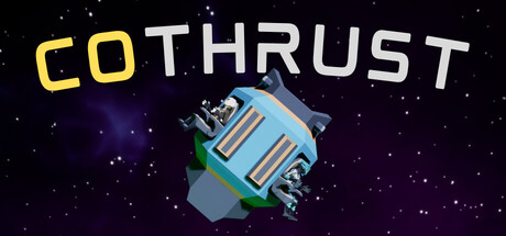
In the darkness of space, you are not alone. The thrusters are yours. Alone or with a friend, hold your course, resist the chaos, and reach the rescue ship. One controls the left thruster, the other the right. But be careful—when the thrusters overheat, they lose all power.

$1.99Positive(14)
Co-opPhysicsPlatformer
JKY StudioNov 11, 2025

CoThrust scores 68/100 — better than 12% of Co-op capsules (n=1,513).

Positive (14 reviews) · $1.99 · Released Nov 11, 2025 · By JKY Studio

Quick text summary

CoThrust scored 68/100 on Steam Analyzer — Solid for a Co-op capsule. Top priority fix: [uniqueness_polish] Introduce a signature visual element—such as a stylized character hand gripping controls, dual-color thruster jets, or a split-screen motif—to communicate the cooperative mechanic and differentiate from generic space games.

Capsule scores by dimension

  • Genre Clarity: 7/10 — Space physics puzzle clear. The starfield background, floating spaceship thruster object, and sci-fi aesthetic clearly signal a space-based game. The visual immediately suggests a physics or puzzle mechanic centered on thrust control. At tiny size, the thruster silhouette remains recognizable enough to imply the core mechanic, though genre specificity (cooperative multiplayer physics puzzle) requires prior knowledge.
  • Title Readability: 8/10 — Bold title high contrast. COTHRUST is rendered in large yellow-gold capitals with clean sans-serif letterforms positioned prominently in the upper left. The color contrast against the dark space background is excellent, and the text remains legible at small and tiny sizes without loss of clarity. No decorative effects compromise readability, and spacing is controlled and intentional.
  • Contrast & Color: 8/10 — Strong value separation. Yellow title pops sharply against deep black, and the blue-and-green thruster object stands out with bright saturated hues in the mid-right zone. Purple nebula accents add depth without muddy mid-tones. Silhouette separation is clean even when squinting, and the dark space background provides excellent negative space for all foreground elements.
  • Uniqueness & Polish: 6/10 — Competent but familiar space theme. The 3D-modeled thruster and starfield are clean and well-rendered, but the overall composition feels like a standard space game capsule without a standout visual hook or narrative moment. The thruster object itself is the unique selling point, yet the execution reads as functional rather than memorable or distinctive compared to top-tier indie capsules. Polish is solid but doesn't differentiate.
  • Brand Consistency: 5/10 — Generic space aesthetic no signature. The capsule presents a clean sci-fi visual language with no recognizable icon, character, or signature palette that would enable brand recall across multiple marketing touchpoints. While internally cohesive (stars, thruster, purple nebula form a unified space theme), the design lacks a memorable motif or visual identity signal that would distinguish CoThrust from other space indie games in visual memory alone.
  • Composition: 7/10 — Balanced layout with clear focus. The thruster object is positioned in the right-center zone as the focal point, with title anchored upper left and starfield distributed evenly across the background. Hierarchy is clear: title first, thruster second, environment third. At tiny size, the focal point remains readable, though supporting starfield detail is lost—a acceptable tradeoff. Layout respects safe margins and avoids edge-hugging or awkward voids.

What works

  • Strong title contrast and legibility. Yellow-gold COTHRUST letterforms maintain excellent readability from full size down to tiny thumbnail without any loss of clarity or collapse.
  • Clear focal point with thruster object. The blue-green 3D thruster model is positioned as an unambiguous primary subject that guides attention and remains recognizable at all viewing sizes.
  • Effective dark background use. Deep black space provides excellent negative space contrast that allows bright foreground elements to pop and maintains visual separation even in quick scroll.

What hurts the capsule

  • Generic space theme lacks distinctive identity. Starfield, thruster, and nebula are competent but archetypal space game visuals with no memorable or signature visual hook that differentiates the brand.
  • No emotional or mechanical storytelling. The capsule shows a floating thruster but does not visually communicate the unique cooperative two-player mechanic, overheat system, or the solo vs. co-op challenge that defines gameplay.
  • Minimal brand recognition signals. No character, icon, color palette signature, or visual motif exists that would enable a player to recognize CoThrust from another screenshot or marketing material without the title text.

Priority fixes

  1. [uniqueness_polish] Introduce a signature visual element—such as a stylized character hand gripping controls, dual-color thruster jets, or a split-screen motif—to communicate the cooperative mechanic and differentiate from generic space games.
  2. [brand_consistency] Develop a distinctive color palette or motif (e.g., complementary thruster colors for each player, a signature glitch effect, or a recurring symbol) that will anchor brand memory across store pages and marketing.
  3. [genre_clarity] Add a subtle visual cue of overheat stress—such as glowing red accents, particle distortion, or a warning indicator on the thruster—to hint at the overheat mechanic and clarify gameplay challenge at tiny size.

Store copy priority fixes

  1. [feature_communication] Remove or explain the dangling 'BOMBS' line—either integrate it into the features list with a one-sentence description or delete it entirely.
  2. [uniqueness] Add a sentence after 'COOPERATE' section that articulates the emergent challenge: e.g., 'Disagreements, miscommunication, and split-second timing failures become the real enemy—not just the level design.'
  3. [hook_strength] Strengthen the short description's final line to emphasize consequence and urgency: replace 'when the thrusters overheat, they lose all power' with something like 'misjudge the heat, and you plummet into silence' to heighten emotional stakes.
  4. [tone_match] Replace 'SHOW YOUR STYLE' with a more indie-authentic phrase like 'Find Your Astronaut' or 'Customize Your Escape Pod Companion' to deepen tone consistency.

Related guides

Steam app ID: 4027680 · Tags: Co-op, Physics, Platformer, Action-Adventure, Casual