Scoring genre clarity...
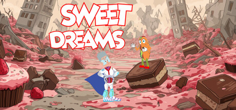
Sweet Dreams is a single player 2d Platformer starring "Dream Boy", a kid Super Hero trapped in a dream world filled with sweets and candy. Help "Dream Boy" make it out of the Dream World and back to the real world.
Free to Play3 user reviews
ActionArcade2D Platformer
1987xclusiveOct 9, 2025