Scoring genre clarity...
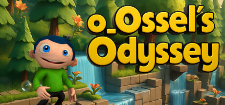
Ossel’s Odyssey is a quirky 2.5D side-scrolling platformer in the spirit of classic Rayman-style games, but with its own absurd, dry sense of humor. Originally created by Oliver Stephan (creaturelab3d), it blends nostalgic gameplay with oddball surprises.
Free to Play8 user reviews
AdventureActionSingleplayer
creaturelab3dOct 12, 2025