Scoring genre clarity...
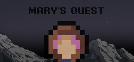
Help May conquer the summit in this charming 2D adventure! Leap across platforms, avoid tricky traps, and master each chapter. Test your reflexes, explore vibrant environments, and conquer the mountain in this indie adventure.
Free to Play6 user reviews
Adventure2D PlatformerIndie
helmoOct 8, 2025