Scoring genre clarity...
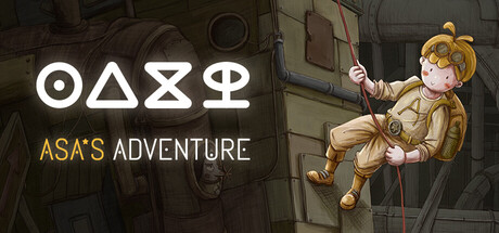
Asa's Adventure capsule

Asa's Adventure

Exquisite hand-drawn puzzle game. A lonely wanderer arrives in a desolate world, adrift and lost. Along his journey, he discovers and collects shimmering stars, each with a unique way to unlock. A journey that finds its quiet warmth.

Point & ClickAdventurePuzzle
xiaoshiQ4 2026

Asa's Adventure scores 72/100 — better than 42% of Point & Click capsules (n=1,749).

Released Q4 2026 · By xiaoshi

Quick text summary

Asa's Adventure scored 72/100 on Steam Analyzer — Good for a Point & Click capsule. Top priority fix: [genre_clarity] Enhance environmental detail or add visual worldbuilding element at mid-ground to strengthen the 'desolate world' setting and differentiate from generic adventure platforms at small sizes.

Capsule scores by dimension

  • Genre Clarity: 7/10 — Adventure puzzle clear, character-focused. The hand-drawn protagonist suspended on a rope in an industrial environment immediately signals adventure and exploration. The whimsical character design and puzzle-game setting are clear at full size, though at tiny size the industrial setting becomes less distinct and reads more generically as 'adventure platformer.' The character silhouette remains readable and carries the adventure intent across all sizes.
  • Title Readability: 8/10 — Strong symbol-text hierarchy works. The white geometric symbol row (ΟΔΞΦ) at top acts as a distinctive logo that reads clearly even at tiny size, followed by clean white and gold 'ASA'S ADVENTURE' text with excellent contrast against the dark background. The tagline placement is balanced and the two-tier text structure maintains legibility down to small sizes. At tiny size, the geometric symbols remain the strongest recognition anchor, though the full title becomes less distinct.
  • Contrast & Color: 8/10 — Bright character pops cleanly. Asa's golden-blonde hair and cream-colored outfit create strong value separation against the dark industrial gray-brown environment and Steam's #1b2838 background. The white title text and gold 'ADVENTURE' subtitle further amplify contrast. The silhouette test holds firm—the character reads as a bright focal point even in grayscale, though the background remains somewhat mid-tone and muddy by comparison.
  • Uniqueness & Polish: 7/10 — Hand-drawn charm tempered by familiarity. The hand-drawn art style and whimsical character design convey craft and personality distinctly from generic AAA adventure fare, positioning it well within the indie/casual tier. However, the 'lonely wanderer in desolate world' concept and industrial-meets-adventure setting lean into familiar tropes seen in many modern indie adventures like Jusant or Viewfinder. The execution is polished but the core visual hook feels somewhat derivative of the broader indie adventure landscape.
  • Brand Consistency: 6/10 — Geometric symbols distinctive, limited identity. The geometric symbol logo (ΟΔΞΦ) is unique and memorable—a strong internal brand cue that could anchor recognition. Asa's character design is consistent and personable, with a recognizable color palette of warm creams and golds. However, without additional visual consistency anchors or environmental styling that signals a cohesive world, the brand identity relies heavily on the protagonist and symbol alone, limiting the depth of internal cohesion signals typical of stronger indie brands.
  • Composition: 7/10 — Clear focal point, balanced text placement. Asa occupies right-center space as a strong primary focal point with clear depth from the industrial background. The title is stacked at upper-left in a controlled manner that avoids competing with the character. The layout respects safe margins and avoids Steam cropping hazards. At tiny size, the character remains the dominant element, though the background detail becomes visual noise and the composition reads more as 'bright figure on dark field' rather than a rich scene.

What works

  • Distinctive geometric logo. The symbol row ΟΔΞΦ is unique, memorable, and reads clearly at all sizes, providing strong brand anchoring.
  • Strong character silhouette and color. Asa's bright cream and gold palette pops distinctly against the dark background and remains legible even at tiny sizes.
  • Clean two-tier text hierarchy. White primary title and gold subtitle sit on controlled background space with excellent contrast and readable letterforms throughout.
  • Balanced composition avoids clutter. Character occupies right frame space while title lives safely at upper-left, leaving no dead center void and respecting Steam crop zones.

What hurts the capsule

  • Industrial background loses clarity at small sizes. The machinery and metal textures recede into visual noise when scaled down, reducing environmental storytelling and reading as generic brown-gray texture.
  • Limited world-building visual cues. The capsule shows character and setting but lacks distinctive environmental or thematic visual language that signals a unique world identity compared to peer titles.
  • Familiar adventure trope treatment. The lonely wanderer plus industrial environment concept echoes existing indie successes without a clear visual differentiation hook that would make this stand out in genre browsing.

Priority fixes

  1. [genre_clarity] Enhance environmental detail or add visual worldbuilding element at mid-ground to strengthen the 'desolate world' setting and differentiate from generic adventure platforms at small sizes.
  2. [uniqueness_polish] Introduce a secondary visual signature element tied to the 'shimmering stars' core mechanic (e.g., subtle star glow or unique UI motif) to establish a clearer selling point distinct from peer titles.
  3. [contrast_color] Warm the industrial background or add subtle rim lighting to the character to increase separation between figure and environment in the mid-tone range, strengthening silhouette at all sizes.

Store copy priority fixes

  1. [feature_communication] Add a concrete puzzle example early in the detailed description: instead of abstract language, show one specific chest and its unlock method (e.g., "Find a chest locked with three gears—rotate them to match the star's symbol pattern").
  2. [genre_clarity] Incorporate platforming language into the detailed description if movement-based challenges are core to progression, or remove the Puzzle Platformer tag if they are secondary.
  3. [uniqueness] Add 1-2 sentences articulating what distinguishes this game's puzzle design from other hand-drawn adventure games (e.g., how the star-hint system creates novel puzzle feedback, or what the narrative payoff for collecting stars involves).
  4. [audience_targeting] Insert a sentence near the end that explicitly invites the target player: e.g., 'Perfect for players seeking a contemplative, story-rich puzzle experience without action or time pressure.'

Related guides

Steam app ID: 4032860 · Tags: Point & Click, Adventure, Puzzle, Hand-drawn, Steampunk