Scoring genre clarity...

Pentamania: Alchemy Madness capsule

Pentamania: Alchemy Madness

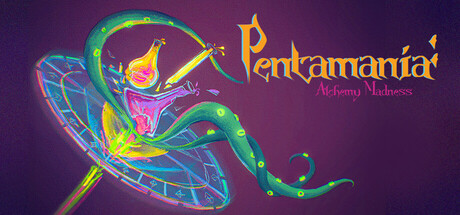
Step into a VR alchemy workshop, gather rare ingredients, and combine them with cauldrons, and magical machines to brew fantastical potions. Experiment, discover, and deliver your creations in an immersive fantasy experience!!

Free to Play4 user reviews
CasualSimulationPuzzle
Athmyx, Rong, Navinor, Brogan, Dillion, MelodieOct 26, 2025

Pentamania: Alchemy Madness scores 67/100 — better than 15% of Casual capsules (n=10,153).

4 user reviews · Free to Play · Released Oct 26, 2025 · By Athmyx

Quick text summary

Pentamania: Alchemy Madness scored 67/100 on Steam Analyzer — Solid for a Casual capsule. Top priority fix: [title_readability] Replace decorative serif font with a bold, sans-serif typeface that maintains legibility below 120px, and increase font weight to ~700 for better contrast at tiny size.

Capsule scores by dimension

  • Genre Clarity: 7/10 — Fantasy alchemy magic gameplay clear. The glowing potion vial, swirling magical energy, and fantastical art style immediately signal a magical/alchemy-focused game rather than action or puzzle. At TINY size, the bright magical aura and mystical creature silhouette still communicate 'fantasy magic' effectively, though the VR/simulation aspect is not visually apparent. The neon glow and cauldron-like object reinforce the potion-brewing premise well.
  • Title Readability: 5/10 — Title readable at full, lost at tiny. At full resolution, 'Pentamania' is legible in bright yellow-gold with decorative serif styling, and 'Alchemy Madness' is visible below in smaller magenta text. At SMALL size, the letter spacing tightens and the decorative elements begin to blur; at TINY size below 120px, the serif font collapses into illegibility and both lines merge into an unreadable blur. The tagline 'Alchemy Madness' is completely unreadable at thumbnail scale.
  • Contrast & Color: 8/10 — Vibrant neon pop against dark purple. The bright lime-green serpent, hot pink/magenta vial, and golden-yellow accent colors create strong value separation against the deep purple background (#1b2838 approximated). The glowing outline effect on key elements and saturated warm tones ensure high contrast even in grayscale; the silhouette of the magical creature remains clear and distinct at all sizes. Minor issue: some mid-tone blue details on the vial read softer in comparison.
  • Uniqueness & Polish: 7/10 — Distinctive art with polished glow effects. The hand-drawn magical creature and intricate line-art potion vial demonstrate above-average craft, with cohesive neon glow effects that feel intentional rather than generic. The art style is more distinctive than typical casual simulators, leaning into a premium indie aesthetic. However, the composition is still fundamentally a centered floating object—while beautifully rendered, it lacks a unique narrative hook or mechanical visual that sets it apart from other alchemy/potion games.
  • Brand Consistency: 6/10 — Consistent magical theme, limited identity. The neon glow, purple-to-pink palette, and magical serpent motif are internally coherent and suggest a recognizable visual identity for repeated viewing. Without access to full store asset context, the visual language feels cohesive and fantasy-appropriate, but the design does not yet establish a specific iconic character, symbol, or signature that would make it instantly memorable or distinct from other fantasy-themed indie games. The palette and glow style are signature, but not particularly unique to Pentamania specifically.
  • Composition: 7/10 — Centered focal point, balanced depth. The glowing serpent and potion vial form a clear single focal point at center, with supporting magical sparkles and energy trails guiding the eye in a natural arc. The layering of background gradient, mid-tone magical effects, and bright foreground elements creates good depth perception. At SMALL size, the composition remains readable and the focal point holds; at TINY size, the swirling details compress into a coherent glowing mass but individual elements blur together slightly. Title placement in the upper right works well and avoids the central subject.

What works

  • Strong neon contrast against dark background. Lime-green and hot-pink glow elements pop vividly against the purple, ensuring visibility and attention on Steam's dark UI even at small sizes.
  • Clear magical fantasy aesthetic. The serpentine creature, potion vial, and glowing aura immediately communicate 'alchemy magic' and differentiate from mechanical or puzzle-focused simulators.
  • Polished glow and lighting effects. The neon outline and luminous accents create a premium, intentional visual style that elevates the capsule beyond generic asset-based designs.

What hurts the capsule

  • Title font collapses at thumbnail size. The decorative serif 'Pentamania' becomes illegible below ~150px, and the tagline disappears entirely, reducing brand recognition in quick scrolls.
  • Generic centered floating-object composition. While beautifully rendered, the isolated subject against gradient lacks narrative context or mechanical hint that would make the game concept immediately clear beyond 'magic potion game.'
  • Limited unique brand identity cues. No iconic character face, recurring motif, or color signature that would make this capsule instantly recognizable if stripped of text.

Priority fixes

  1. [title_readability] Replace decorative serif font with a bold, sans-serif typeface that maintains legibility below 120px, and increase font weight to ~700 for better contrast at tiny size.
  2. [composition] Add a subtle contextual element (e.g., a cauldron rim, workshop shelf edge, or potion bottles) to suggest the simulation environment and strengthen the game concept hook.
  3. [brand_consistency] Introduce a recurring iconic symbol or character face (e.g., a grinning alchemist, a signature cauldron logo, or a branded potion bottle label) that can anchor future marketing materials and capsule iterations.

Store copy priority fixes

  1. [feature_communication] Expand the detailed description with 2–3 paragraphs explaining: (1) what potion types exist and how they are created; (2) how 'magical machines' differ from cauldrons in function; (3) what 'Medical Sim' gameplay entails (e.g., crafting medicines for patient outcomes).
  2. [uniqueness] Add a concrete differentiator such as 'the only VR alchemy game where your potion choices affect NPC health outcomes' or 'combines free-form ingredient experimentation with puzzle-based recipe discovery.'
  3. [audience_targeting] Clarify whether this is a relaxing sandbox experience or a challenge-based progression sim to help players self-select; mention solo-only play style and expected session length.
  4. [hook_strength] Rewrite the opening line to lead with the most distinctive mechanic or emotional promise, e.g., 'Discover hidden potion recipes by experimenting with rare ingredients in a physics-based VR alchemy lab' instead of the generic 'Step into' framing.

Related guides

Steam app ID: 4033240 · Tags: Casual, Simulation, Puzzle, Immersive Sim, Medical Sim