Scoring genre clarity...
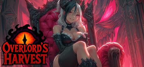
Overlord’s Harvest is an incremental action game where you slay humans, elves, and dwarves to gather souls. Spend them on talents, weapon upgrades, and the Maw, your idle soul engine, and grow stronger with every harvest. Will you claim the throne of the demon lord?
$4.99Mostly Negative(16)
CasualIndieIncremental
ISSA GameNov 21, 2025