Scoring genre clarity...
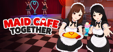
Maid Cafe Simulator capsule

Maid Cafe Simulator

Maid Cafe Simulator is a fun cafe management simulation that will immerse you in the heart of Japanese pop culture. Build your dream maid cafe, train your maids, design your menu, and win over your customers!

SimulationShop KeeperManagement
HOGO GamesComing soon

Maid Cafe Simulator scores 68/100 — better than 17% of Simulation capsules (n=5,401).

Released Coming soon · By HOGO Games

Quick text summary

Maid Cafe Simulator scored 68/100 on Steam Analyzer — Solid for a Simulation capsule. Top priority fix: [uniqueness_polish] Add a visual element that communicates a unique mechanic or selling point—such as menu customization icons, customer satisfaction meter, or a distinctive character pose that hints at core gameplay.

Capsule scores by dimension

  • Genre Clarity: 7/10 — Anime cafe management clearly signaled. The maid character in Japanese cafe uniform, the word 'Cafe' in the title, and the pink anime aesthetic immediately communicate a management simulation with anime/Japanese cultural themes. At tiny size, the character silhouette and pink background still read as anime cafe-themed, though the 'Simulator' text becomes hard to parse. The visual genre cues are strong enough to distinguish this from other simulators in the category.
  • Title Readability: 8/10 — Clear title with readable white script. The title 'Maid Cafe Simulator' uses a large, clean white script font with consistent letterforms and good contrast against the pink background. At small and tiny sizes, the title remains legible due to the bold weight and high value contrast. The subtitle 'Simulator' is positioned below and maintains readability, though it becomes slightly soft at the tiniest scale.
  • Contrast & Color: 7/10 — Strong warm pink with good separation. The saturated pink background (#FFB6D9 or similar) creates warm, appealing contrast against the Steam dark background. The brown-haired character and black maid outfit create mid-tone separation that reads cleanly at small sizes. The white title pops clearly in grayscale, though the background patterns reduce some edge sharpness at tiny sizes.
  • Uniqueness & Polish: 6/10 — Competent anime style, somewhat generic. The execution is clean with a polished character illustration and consistent color treatment, but the design relies heavily on standard anime cafe aesthetics without a distinctive visual hook or unique selling point. The capsule communicates the concept clearly but doesn't convey what makes this simulator stand out from others in the genre—mechanics, humor, or gameplay hooks are absent from the visual storytelling.
  • Brand Consistency: 6/10 — Cohesive anime palette, limited identity. The design maintains internal consistency with the pink palette, anime character style, and maid cafe theme throughout. However, there is no memorable iconic motif, signature symbol, or distinctive brand mark that would make this recognizable as uniquely 'Maid Cafe Simulator' versus other anime cafe games. The palette is thematically correct but not ownership-establishing.
  • Composition: 7/10 — Well-centered character, balanced layout. The maid character is positioned in the upper-right to center-right area, creating a clear focal point that guides the eye naturally. The title anchors the left side with good visual weight distribution. At small and tiny sizes, the character remains the primary subject and the composition holds without clutter, though the background patterns create some visual noise that competes slightly at the smallest scales.

What works

  • Strong title contrast and legibility. White script text reads cleanly against the pink background at all sizes, with consistent letterforms and weight.
  • Clear character focal point. The maid character illustration is well-positioned and distinct enough to remain recognizable at tiny size, anchoring the visual identity.
  • Thematic color palette. The warm pink, anime aesthetic, and character outfit all coherently communicate the Japanese cafe management theme.

What hurts the capsule

  • Generic anime simulator presentation. The capsule relies on standard anime cafe aesthetics without visual cues that differentiate this simulator's unique mechanics or gameplay hooks.
  • Busy background pattern reduces clarity. The ornamental pink patterns in the background add visual noise that slightly competes with the character and reduces edge definition at tiny size.
  • Limited brand identity markers. No signature symbol, iconic motif, or distinctive visual element that would make this game immediately recognizable as a specific title versus similar anime cafe games.

Priority fixes

  1. [uniqueness_polish] Add a visual element that communicates a unique mechanic or selling point—such as menu customization icons, customer satisfaction meter, or a distinctive character pose that hints at core gameplay.
  2. [brand_consistency] Introduce a signature motif or icon (e.g., a stylized cafe logo, symbol, or badge) that can become the game's visual brand across store pages and community recognition.
  3. [contrast_color] Simplify or reduce the intensity of background patterns to strengthen character silhouette separation and improve clarity at tiny thumbnail size.

Store copy priority fixes

  1. [uniqueness] Add a sentence comparing this to other cafe sims or highlighting a signature mechanic—e.g., 'Unlike standard cafe games, maid performances directly impact viral potential' or 'The only cafe sim where your staff's personalities unlock entirely different entertainment options.'
  2. [genre_clarity] Remove or explain the FPS tag in the tags section, as it actively contradicts the simulation/management positioning and confuses browsing players.
  3. [audience_targeting] Include a brief note on difficulty curve or target skill level—e.g., 'Perfect for management sim fans and casual players alike' or 'Challenging enough for simulation veterans'—to set expectations.

Related guides

Steam app ID: 4036670 · Tags: Simulation, Anime, Management, Cooking, Female Protagonist