Scoring genre clarity...
Scoring genre clarity...
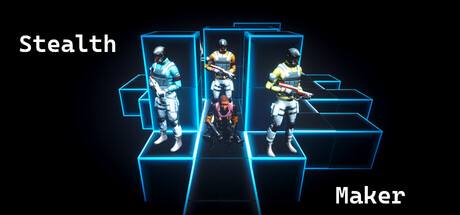
Stealth Maker scores 67/100 — better than 13% of Action capsules (n=9,073).
$0.99 · Released Jan 21, 2026 · By VirtualGameStudio
Stealth Maker scored 67/100 on Steam Analyzer — Solid for a Action capsule. Top priority fix: [genre_clarity] Add a visual element that communicates 'level design/creation' (e.g., grid overlay, blueprint aesthetic, or a UI editor panel hint) to surface the core mechanic beyond text.
Steam app ID: 4037820 · Tags: Action, Simulation, Strategy, Grand Strategy, Platformer