Scoring genre clarity...

Shopping Cart Pusher capsule

Shopping Cart Pusher

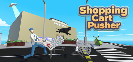
Experience the supermarket version of Grand Theft "Shopping Cart"! This is no easy job. You'll need plenty of patience, a sharp mind, and nimble hands to become a qualified shopping cart pusher, otherwise, I guarantee you'll never find all the carts!

$2.992 user reviews
DifficultPhysicsSandbox
Jack LiOct 10, 2025

Shopping Cart Pusher scores 72/100 — better than 37% of Difficult capsules (n=1,060).

2 user reviews · $2.99 · Released Oct 10, 2025 · By Jack Li

Quick text summary

Shopping Cart Pusher scored 72/100 on Steam Analyzer — Good for a Difficult capsule. Top priority fix: [brand_consistency] Add a distinctive character trait or iconic visual element (unique clothing, accessory, or pose) to the protagonist that could serve as a recognizable brand signature across future marketing materials.

Capsule scores by dimension

  • Genre Clarity: 7/10 — Clear casual simulation premise. The capsule immediately communicates a humorous shopping cart collection game through the visual of a character with an overturned shopping cart in an urban supermarket setting. At TINY size, the cart and character silhouettes remain readable, clearly signaling a simulation/casual game mechanic. The bright, playful art style and comedic scenario (carts scattered in traffic) effectively convey the lighthearted tone without ambiguity about genre.
  • Title Readability: 8/10 — Bold readable title placement. The title 'Shopping Cart Pusher' uses a thick orange-gold outline font positioned in the top right against clear sky background, ensuring strong separation from scene elements. At SMALL size the text remains legible with good contrast; at TINY size the outlined letters hold their form well. The strategic placement on negative space rather than over busy textures significantly aids readability across all viewing sizes.
  • Contrast & Color: 8/10 — Strong value separation, vibrant palette. The bright blue sky background (#87CEEB range) contrasts sharply against the warm beige/tan supermarket structure, gray pavement, and character clothing. The orange title text pops distinctly against the sky. In grayscale, the sky-to-ground separation remains clear with solid mid-tone differentiation, and the character and cart silhouettes maintain readable edges throughout size reductions.
  • Uniqueness & Polish: 7/10 — Polished humor with competent execution. The concept of a GTA-style shopping cart collection game is inherently distinctive and well-executed visually, with clean vector-style art, intentional comedic framing (overturned cart, chaotic street setting), and professional rendering. The visual storytelling clearly communicates the core mechanic (finding/collecting scattered carts) without generic filler. However, the execution, while solid, does not feel groundbreaking compared to top-tier indie capsules that establish iconic character or signature style.
  • Brand Consistency: 6/10 — Consistent style, limited identity signals. The capsule demonstrates cohesive art direction with uniform vector-style character design, consistent color palette (bright primary colors, warm accent tones), and clean rendering throughout the scene. However, there are no strong iconic character motifs, signature symbols, or distinctive visual hooks that would make this immediately recognizable as 'Shopping Cart Pusher' on repeat exposure. The style is competent and internally coherent but generic within casual indie aesthetics.
  • Composition: 7/10 — Clear focal point, well-balanced layout. The overturned shopping cart in the foreground with the character creates a strong central focal point that draws immediate attention, supported by street infrastructure and sky background providing context. At SMALL and TINY sizes, the primary subject remains visually dominant. The title placement top-right respects safe margins and doesn't interfere with the scene; depth layering (sky-building-street-character-cart) creates clear spatial hierarchy without clutter or dead zones.

What works

  • Clear comedic premise. The overturned shopping cart and urban street setting immediately communicate the game's humorous GTA-parody concept without confusion.
  • Excellent title contrast and placement. The orange-outlined text sits cleanly against clear sky background and remains readable down to TINY sizes with strong value separation.
  • Strong color-background separation. Bright blue sky and warm structure tones create natural visual separation that survives grayscale conversion and maintains clarity at small sizes.
  • Effective visual storytelling. The scene composition clearly conveys the core mechanic (shopping cart collection chaos) without requiring text interpretation.

What hurts the capsule

  • Limited brand identity hooks. No distinctive character design, iconic symbol, or signature visual element that would create memorable brand recall on repeated exposure.
  • Generic vector art style. While well-executed, the flat vector aesthetic and character design lack the distinctive polish or art direction that would elevate uniqueness above competent baseline.
  • No gameplay progression visual. The capsule shows the scenario but doesn't communicate what makes this game special mechanically compared to other collection/simulation titles.

Priority fixes

  1. [brand_consistency] Add a distinctive character trait or iconic visual element (unique clothing, accessory, or pose) to the protagonist that could serve as a recognizable brand signature across future marketing materials.
  2. [uniqueness_polish] Incorporate a visual that hints at the 'GTA-style' hook or progression system (e.g., multiple carts in background, difficulty escalation visual) to differentiate from generic simulation games.
  3. [composition] Consider adding small environmental details (store signage, scattered items) in the mid-ground to reinforce supermarket context and add personality without cluttering the focal point.

Store copy priority fixes

  1. [feature_communication] Replace vague phrases with concrete examples: instead of 'use surrounding objects to discover hidden information,' write 'push barrels and signs to reveal clues and unlock puzzle paths' to help players visualize actual gameplay.
  2. [hook_strength] Lead the short description with the core gameplay verb: 'Push 50 missing shopping carts across a chaotic physics-driven mall' before the Grand Theft reference to immediately clarify the activity.
  3. [uniqueness] Add 1-2 sentences explaining the physics system's distinct challenge or the puzzle design philosophy—e.g., 'inertia and impact deformation make every cart behave unpredictably, turning retrieval into a skill puzzle' to differentiate from generic physics games.
  4. [audience_targeting] Insert a sentence targeting the intended player type: 'Perfect for players who enjoy twitchy, physics-heavy puzzles with a comedic edge and hidden secrets to uncover' to signal niche appeal without alienating casual players.

Related guides

Steam app ID: 4038570 · Tags: Difficult, Physics, Sandbox, Puzzle, Sokoban