Scoring genre clarity...
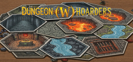
Dungeon (W)Hoarders is a laid-back 2D dungeon crawler inspired by classic tabletop quests. Guide "the legendary Hero!" across a shifting, hex-based map, combining the thrill of a grand saga with the simplicity of a mouse-clicker. Every decision matters as you seek challenges, monsters, and loot.
$4.991 user reviews
CasualIncrementalDungeon Crawler
Chad McCoskeyOct 7, 2025