Scoring genre clarity...
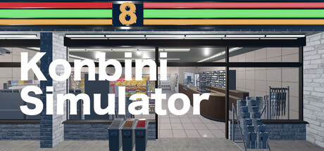
Konbini Simulator lets you manage your own convenience store! Handle inventory, serve customers, and expand your business. Customize your shop, complete daily challenges, and manage a wide range of products to create the ultimate shopping experience. Perfect for casual players and simulation fans.
$4.99Mixed(13)
3D PlatformerImmersive SimSimulation
mobaroidDec 16, 2025