Scoring genre clarity...
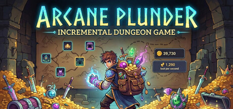
Explore enchanted dungeons shrouded in magical fog. Reveal hidden paths, uncover treasures, and telekinetically loot artifacts from the shadows. Upgrade your magic, extend your reach and dive deeper into the unknown in this bite sized idle clicker adventure.
$3.99Mixed(16)
CasualIncrementalIdler
Bart MamzerMay 8, 2026