Soulcrossed scores 75/100 — better than 78% of Visual Novel capsules (n=1,147).

Quick text summary

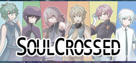
Soulcrossed scored 75/100 on Steam Analyzer — Good for a Visual Novel capsule. Top priority fix: [genre_clarity] Add subtle SRPG visual cue such as a small grid overlay, battle UI element, or strategic pose hint to communicate the hybrid genre accurately.

Capsule scores by dimension

  • Genre Clarity: 7/10 — Visual novel with character focus. The capsule clearly communicates a visual novel through six distinct character portraits arranged horizontally with varied color-coded backgrounds. At TINY size, the character silhouettes and pastel palette remain readable, though the SRPG battle aspect is not visually communicated. The character-driven composition signals narrative focus effectively.
  • Title Readability: 8/10 — Bold white title, excellent contrast. The white 'SOULCROSSED' text with black outline sits prominently across the center, maintaining legibility at all viewing sizes including TINY. The letterforms are clean and sans-serif, with sufficient weight and spacing. The title placement over the character section ensures it never competes with the background noise of individual portraits.
  • Contrast & Color: 8/10 — Pastel palette with strong separation. Six distinct pastel background panels (green, purple, pink, peach, yellow, blue) create clear value separation and visual rhythm against the dark Steam background. White title text and character line art silhouettes pop clearly even at TINY size. The grayscale test shows good mid-to-light tone distribution that prevents muddy blending.
  • Uniqueness & Polish: 7/10 — Distinctive visual novel presentation. The color-coded character panel approach is a recognizable visual novel convention executed cleanly with consistent anime-style character art. The pastel palette and organized grid layout feel polished and intentional rather than generic. However, it does not uniquely communicate the SRPG hybrid mechanic, keeping it from feeling particularly distinctive beyond the genre norm.
  • Brand Consistency: 7/10 — Cohesive character-centric identity. All six characters share consistent anime illustration style, line weight, and color grading that signals a unified visual identity. The pastel color blocking is internally cohesive and likely matches store screenshots. The style is recognizable as a specific visual novel property, though lacks a unique signature motif or icon beyond the character lineup itself.
  • Composition: 8/10 — Clear hierarchy, balanced grid layout. The six-character grid creates strong focal organization with title centered overhead, leaving no dead space or awkward voids. Each character occupies equal visual weight within their colored panel, which works well at SMALL and TINY sizes where the overall shape remains clear. Character silhouettes guide the eye horizontally while the title anchors the composition vertically.

What works

  • Strong title contrast and legibility. White text with black outline on varied backgrounds maintains perfect readability from full header down to tiny thumbnail size.
  • Cohesive character illustration style. All six portraits share consistent line art, proportions, and anime aesthetic that reinforces a unified visual identity.
  • Effective color-coded compartmentalization. Pastel background panels create visual rhythm and clarity that prevents the composition from feeling crowded even with multiple characters.
  • Clear visual novel genre signaling. Character lineup and portrait focus immediately communicate narrative-driven gameplay to the target audience.

What hurts the capsule

  • SRPG mechanic not visually communicated. The capsule reads purely as visual novel; there is no visual hint of the strategic battle system, potentially misleading players unfamiliar with the title.
  • Generic visual novel template feel. While well-executed, the character grid approach is a standard visual novel presentation that lacks a distinctive hook or unique visual selling point beyond the art itself.
  • Limited visual storytelling depth. The composition shows character lineup but does not hint at tone, premise, or what makes this specific visual novel memorable or different from competitors.

Priority fixes

  1. [genre_clarity] Add subtle SRPG visual cue such as a small grid overlay, battle UI element, or strategic pose hint to communicate the hybrid genre accurately.
  2. [uniqueness_polish] Introduce a signature visual motif, symbol, or thematic element unique to Soulcrossed to increase distinctiveness beyond standard character lineup format.
  3. [composition] Consider layering a subtle background scene or thematic element behind the character panels to add visual depth and narrative context without cluttering the readable title area.

Store copy priority fixes

  1. [uniqueness] Replace 'A visual novel with SRPG battles' with a specific hook about the demon-girl bond and how it ties to tactical or narrative choices (e.g., 'Play as a demon bound to a girl—your choices reshape both the battlefield and your shared soul').
  2. [feature_communication] Add one concrete example of a puzzle-like battle mechanic or environmental interaction in the detailed description (e.g., 'Each boss encounter features unique map layouts and environmental hazards that reward clever positioning over raw damage').
  3. [audience_targeting] Clarify the difficulty and pacing for different player types—specify if this targets tactics enthusiasts, visual novel readers, or both equally, and give a sense of story-to-combat ratio or estimated playtime.
  4. [hook_strength] Expand the short description to hint at the demon-girl premise as the emotional core rather than generic 'mind and heart' language (e.g., 'Bound to a girl's fate, you must master tactical combat and navigate a fractured soul in the world of siphony').

Related guides

Steam app ID: 4043550 · Tags: Visual Novel, Tactical RPG, 2D, Hand-drawn, Fantasy