Scoring genre clarity...
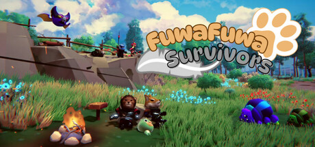
Survive with Fluffy Friends! In this 3D Survivor-like Action Roguelite, you Control adorable animals, Defeat swarms of enemies and Tame them to your Royal Companions! Utilize Skill Enchantment system to combine 20+ skills with 70+ Enchantment Cards to forge your unique builds!
$5.998 user reviews
Bullet HeavenAction RoguelikeRoguelite
開墾魂Mar 5, 2026