Scoring genre clarity...

Jaw Jump! capsule

Jaw Jump!

Your face is the controller! Will you reach the goal first, or will your facial muscles give up first?

$3.993 user reviews
FunnyActionSingleplayer
Airy GamesNov 10, 2025

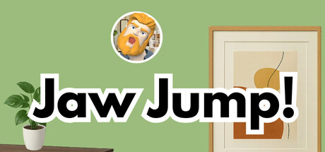
Jaw Jump! scores 68/100 — better than 17% of Funny capsules (n=3,049).

3 user reviews · $3.99 · Released Nov 10, 2025 · By Airy Games

Quick text summary

Jaw Jump! scored 68/100 on Steam Analyzer — Solid for a Funny capsule. Top priority fix: [genre_clarity] Add a subtle visual cue that hints at facial control mechanic—consider exaggerating the character's mouth or jaw position to suggest the gameplay hook even at tiny size

Capsule scores by dimension

  • Genre Clarity: 7/10 — Clear indie action vibe. The playful character design with exaggerated facial expression and the simple framed interior setting signal an indie game with lighthearted tone rather than traditional action. At tiny size, the character's expressive face and casual environment read as quirky indie rather than hardcore action, though the genre connection to facial control mechanics is not visually obvious without context.
  • Title Readability: 8/10 — Bold white text, excellent contrast. The title 'Jaw Jump!' uses a thick, bold sans-serif typeface in white with a dark outline, placed on the mid-tone green background. This placement and treatment maintain readability at small and tiny sizes, though the exclamation mark could be slightly more prominent at thumbnail scale.
  • Contrast & Color: 7/10 — Good separation on warm palette. The soft sage green background provides adequate contrast against the white title text and the warm-toned character circle and framed plant element. The warm orange character and beige-tan picture frame create visual interest but sit in a similar mid-tone range that slightly reduces silhouette separation at tiny sizes.
  • Uniqueness & Polish: 6/10 — Charming but somewhat generic indie. The design has craft and intentionality with the styled character portrait and interior scene setup, but the overall aesthetic feels like a competent indie game capsule without a particularly distinctive visual hook. The whimsical furniture and plant elements are pleasant but don't communicate the unique 'face is controller' mechanic that makes this game stand out.
  • Brand Consistency: 6/10 — Consistent palette, limited iconic signature. The sage green, warm orange, and cream tones create a cohesive internal palette, and the character design with exaggerated expression is memorable. However, without access to other marketing materials in this analysis context, there are no strong iconic symbols or motifs that would be distinctly recognizable as 'Jaw Jump!' across different media.
  • Composition: 7/10 — Clear focal point, balanced layout. The character circle sits in the upper center as the primary focal point, with the framed plant providing secondary interest on the right and the potted plant on the left creating frame balance. The title placement across the center is clear, though at tiny size the supporting decorative elements (plant, frame, pot) could read as visual clutter distracting from the main character.

What works

  • Strong title contrast and legibility. White bold sans-serif with outline maintains readability from full size down to tiny thumbnail against the green background.
  • Cohesive warm color palette. The sage green, warm orange, and cream tones create a unified, pleasant aesthetic that feels intentional and polished.
  • Clear primary focal point. The character expression in the circle effectively draws the eye first and communicates personality and charm.

What hurts the capsule

  • Core mechanic not visually communicated. Nothing in the capsule suggests 'facial control' or 'facial muscles' gameplay; the design prioritizes whimsy over mechanical clarity.
  • Supporting elements dilute focus at small sizes. The potted plant, picture frame, and background clutter compete for attention when viewed at tiny thumbnail scale where only one clear subject should dominate.
  • Generic indie aesthetic without distinctive hook. While well-executed, the cozy interior with plant decor reads as a common indie game visual trope rather than something uniquely 'Jaw Jump.'

Priority fixes

  1. [genre_clarity] Add a subtle visual cue that hints at facial control mechanic—consider exaggerating the character's mouth or jaw position to suggest the gameplay hook even at tiny size
  2. [uniqueness_polish] Simplify background clutter and emphasize the character as the sole focal point to increase visual distinctiveness and stop the design from feeling like a generic cozy game
  3. [composition] Reduce or remove the potted plant on the left and consider moving or resizing the framed picture to strengthen the character-as-hero hierarchy at small and tiny scales

Store copy priority fixes

  1. [feature_communication] Add a line stating the approximate playtime and number of levels or stages (e.g., '15+ stages to climb with increasing complexity') to clarify content scope.
  2. [audience_targeting] Expand the opening to hint at the intended play context—'perfect for quick solo challenges or entertaining friends with your silly face controls'—to help target the right players.
  3. [genre_clarity] Include a brief mention of what makes progression harder (e.g., 'narrower platforms, wind physics, moving obstacles') to clarify the gameplay loop beyond jumping and climbing.

Related guides

Steam app ID: 4045060 · Tags: Funny, Action, Singleplayer, Physics, Platformer