Quick text summary
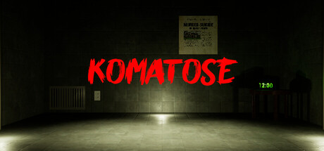
Komatose scored 68/100 on Steam Analyzer — Solid for a Simulation capsule. Top priority fix: [genre_clarity] Introduce a distinctive character, creature, or interactive object (e.g., coma-distorted figure, surreal entity, or puzzle element) to clarify the point-and-click narrative adventure identity.
Capsule scores by dimension
- Genre Clarity: 7/10 — Horror atmosphere clear, mechanics unclear. The dimly lit industrial warehouse setting with harsh spotlight and eerie green timestamp (12:50) immediately signals horror-game territory. However, the point-and-click adventure mechanics are not visually communicated—there are no UI hints, cursors, or inventory elements that would clarify the puzzle-solving or interaction model at any size. At tiny size, it reads as generic horror rather than narrative adventure.
- Title Readability: 8/10 — Bold red title reads well across sizes. The all-caps 'KOMATOSE' in bright red italic serif font has excellent contrast against the dark warehouse background and maintains legibility at small and tiny sizes due to high saturation and clean letter spacing. The title placement in the horizontal center above the focal point is strategic. At tiny size the word remains recognizable despite the italic rendering.
- Contrast & Color: 8/10 — Strong value separation, atmospheric lighting. The bright red title pops sharply against the dark #1b2838 background, and the white spotlight on the warehouse floor creates clear depth and focal hierarchy. The muted green timestamp on the right adds a secondary accent without competing. In grayscale, the light pool and red-to-dark transition remain distinct, supporting silhouette clarity even at tiny size.
- Uniqueness & Polish: 6/10 — Competent horror mood, generic warehouse venue. The capsule nails atmospheric horror presentation with intentional lighting and a comatose-state metaphor (timestamp reinforces disorientation), but the warehouse interior is a common indie horror setting without distinctive character, creature, or mechanic visible. The execution is clean and polished, but the concept feels familiar rather than memorable or hook-driven compared to top-tier indie capsules that showcase a unique visual identity or core mechanic.
- Brand Consistency: 5/10 — No memorable identity cues or iconography. The capsule relies on generic horror atmosphere rather than establishing a recognizable visual brand or signature motif. There are no distinctive character designs, UI styling, symbolic elements, or color palette that could be reused across marketing materials or future recognition. The warehouse and lighting are functional but interchangeable with dozens of other horror titles.
- Composition: 7/10 — Clear focal point with good layering. The composition uses effective depth: dark background (walls and ceiling), midground (warehouse structure and door), and foreground (spotlight pool and checkerboard floor). The title sits comfortably in the upper-center region with breathing room, and the timestamp on the right edge adds subtle asymmetric balance. At small and tiny sizes the spotlight remains the primary visual anchor, though the overall scene reads as somewhat sparse with unused left-side real estate.
What works
- Legible title at all sizes. Bright red italic serif 'KOMATOSE' maintains strong contrast and letter recognition from full header down to tiny thumbnail.
- Atmospheric depth and lighting. Layered warehouse composition with central spotlight creates cinematic horror mood and clear focal hierarchy.
- Consistent horror tone. Dark palette, industrial setting, and eerie timestamp all reinforce a cohesive coma/nightmare aesthetic.
What hurts the capsule
- Generic venue without distinctive hook. Warehouse interior is a common horror trope that does not visually communicate the game's unique point-and-click adventure mechanics or emotional core.
- No character or creature presence. Empty industrial space lacks a memorable visual mascot, enemy design, or protagonist silhouette that would build brand identity.
- Unclear gameplay communication. No UI elements, cursors, inventory hints, or interactive objects visible that would signal adventure/puzzle-solving mechanics to first-time viewers.
Priority fixes
- [genre_clarity] Introduce a distinctive character, creature, or interactive object (e.g., coma-distorted figure, surreal entity, or puzzle element) to clarify the point-and-click narrative adventure identity.
- [uniqueness_polish] Add a signature visual motif or symbol unique to Komatose's coma-state theme—such as a warped dream element, fragmented reality detail, or iconic UI frame—to establish memorable brand identity.
- [brand_consistency] Incorporate a consistent color accent or visual styling (beyond the red title) that can anchor the brand across future screenshots and promotional materials.
Store copy priority fixes
- [feature_communication] Add a sentence describing one or two core gameplay mechanics or puzzle types—e.g., 'manipulate your fractured memories to solve environmental puzzles' or 'interact with distorted hospital spaces to uncover hidden narrative clues.'
- [uniqueness] Insert a specific differentiator after 'uncover the truth' such as 'with multiple endings shaped by your choices' or 'where your decisions within the coma state directly influence your awakening.'
- [audience_targeting] Add one sentence clarifying scope and tone—e.g., 'A 2-3 hour immersive psychological experience for players who value atmosphere and narrative over action' to help self-selection.
Related guides
Steam app ID: 4046020 · Tags: Simulation, Strategy, Point & Click, Immersive Sim, 3D