Scoring genre clarity...

Pogui capsule

Pogui

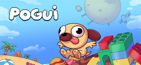
Pogui is a short and charming platformer about a dreamy pug trapped in a nightmare. Travel through 5 worlds filled with creative levels, dozens of different enemies and unique mechanics to help Pogui wake up, if he can escape the entity that imprisoned him in his own dream!

$2.99Positive(14)
Adventure2D PlatformerCasual
Pufferfish DigitalFeb 25, 2026

Pogui scores 78/100 — better than 90% of Adventure capsules (n=7,922).

Positive (14 reviews) · $2.99 · Released Feb 25, 2026 · By Pufferfish Digital

Quick text summary

Pogui scored 78/100 on Steam Analyzer — Good for a Adventure capsule. Top priority fix: [uniqueness_polish] Integrate nightmare or dream visual cues—add subtle dark clouds, surreal atmospheric effects, or eerie color accents to hint at the core story tension and differentiate from generic cute platformers.

Capsule scores by dimension

  • Genre Clarity: 8/10 — Clear platformer with whimsical charm. The cheerful pug protagonist, bright sky setting, colorful platforms, and playful pose immediately signal a casual platformer adventure. At TINY size, the character silhouette and vibrant environment remain readable enough to convey 'cute platformer' genre, though specific mechanics like dream-themed elements are lost. The visual language aligns well with indie platformer conventions without ambiguity.
  • Title Readability: 9/10 — Excellent bold white lettering. The 'POGUI' title uses thick, outlined white letters with a bold black stroke positioned cleanly in the upper left against the sky background. The letterforms remain fully legible at both SMALL and TINY sizes due to the high contrast outline treatment and generous letter spacing. No decorative flourishes compromise readability at any viewing size.
  • Contrast & Color: 8/10 — Strong value separation, vibrant palette. The bright blue sky (#1b2838 contrast is excellent), warm orange pug, red blocks, and green blocks create strong color differentiation that pops against Steam's dark background. The character pops clearly from the midground due to warm-cool color separation, and silhouettes read well in grayscale test due to distinct light-to-dark gradation. Minor loss of contrast in the cloud details which blend slightly into sky.
  • Uniqueness & Polish: 7/10 — Charming art style, competent execution. The rounded, cute character design and pastel-colored world create a distinctive and memorable visual hook that differentiates it from darker or more serious platformers. The craft appears clean with consistent shading and purposeful color choices, though the composition uses familiar platformer elements (bright sky, colorful blocks, friendly character) without a truly breakthrough visual concept. The dream-nightmare theming is not visually emphasized enough to stand out as unique from the capsule alone.
  • Brand Consistency: 7/10 — Cohesive cute aesthetic, limited iconic motifs. The art style is internally consistent—warm pastel tones, rounded shapes, and cheerful character design reinforce a unified brand voice across all visible elements. The pug protagonist serves as a memorable character icon, and the color palette (pastels, bright primaries) is distinctive for the platformer genre. However, there are no secondary brand symbols, UI patterns, or signature visual motifs visible that would aid recognition across multiple touchpoints.
  • Composition: 8/10 — Clear focal point, balanced layering. The pug is positioned as the dominant focal point in the center-right, with the title anchored securely in the upper left and background elements (sky, moon, clouds) supporting without competing. Depth layers read clearly: distant clouds and moon, middle-ground sky, foreground pug and blocks, creating visual hierarchy that works at TINY size. Safe margins protect all critical elements, and the composition remains balanced without dead center voids or awkward cropping risks.

What works

  • Readable title at all sizes. Bold, high-contrast 'POGUI' lettering with black outline remains legible from full header down to tiny thumbnail due to thick strokes and clean positioning.
  • Strong genre signaling. The cheerful pug protagonist, playful pose, colorful platforms, and whimsical sky immediately communicate cute indie platformer without ambiguity.
  • Vibrant color palette contrast. Warm orange character, cool blue sky, bright primary-colored blocks create strong pop against Steam's dark background in quick-scroll scenarios.
  • Clean visual hierarchy. Pug occupies clear focal point with supporting elements (sky, blocks, clouds) layered naturally without competing for attention at any viewing size.

What hurts the capsule

  • Generic platformer composition. While charming, the layout uses familiar conventions (bright sky, cute protagonist, colorful blocks) without a distinctive visual hook that makes it memorable among hundreds of indie platformers.
  • Dream-nightmare theme underutilized. The game's core concept of a pug trapped in a nightmare is not visually emphasized in the capsule; it reads as a generic cute platformer rather than narrative-driven or thematically distinctive.
  • Limited brand identity symbols. Beyond the pug character, there are no secondary icons, UI patterns, or signature visual motifs that would aid brand recognition across multiple store touchpoints or screenshots.

Priority fixes

  1. [uniqueness_polish] Integrate nightmare or dream visual cues—add subtle dark clouds, surreal atmospheric effects, or eerie color accents to hint at the core story tension and differentiate from generic cute platformers.
  2. [brand_consistency] Establish a signature UI or environmental motif (e.g., dream-bubble borders, a recurring enemy silhouette, or dream-themed decorative element) that could appear across all store assets to strengthen brand recall.
  3. [composition] Consider repositioning or adding a secondary visual element (enemy character, dream entity shadow, or iconic level design hint) to create a more layered and story-driven composition that implies the adventure's unique hook.

Store copy priority fixes

  1. [uniqueness] Add 1-2 sentences after 'escape the prison...' that explicitly explain what one mechanic per world is (e.g., 'Ice world introduces slippery slides, fire world requires timed jumps') to show mechanical variety concretely.
  2. [feature_communication] Expand the bullet 'Different mechanics for each world!' into a brief description of how mechanics scale in difficulty or change pacing—this directly supports 'short but unforgettable' claim.
  3. [audience_targeting] Add a line in the detailed description highlighting adjustable difficulty or 'perfect for short play sessions' to reinforce the casual, accessibility-friendly positioning already signaled by tags.

Related guides

Steam app ID: 4046260 · Tags: Adventure, 2D Platformer, Casual, Pixel Graphics, Funny