The House She Haunts scores 65/100 — better than 9% of Action capsules (n=8,534).

Quick text summary

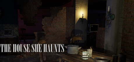
The House She Haunts scored 65/100 on Steam Analyzer — Solid for a Action capsule. Top priority fix: [composition] Introduce or prominently feature the doll as a clear focal point in the center or rule-of-thirds anchor to establish game identity and grab attention at tiny size.

Capsule scores by dimension

  • Genre Clarity: 7/10 — Horror atmosphere evident, genre ambiguous. The dimly lit interior space with institutional brick walls, sparse furniture, and ominous lighting strongly signal horror or survival elements. At tiny size, the silhouette reads as a tense indoor scene, but the action-adventure gameplay loop is not visually clear—it could be survival horror, psychological thriller, or escape room puzzle. The doll mentioned in description is not visible or readable as a focal point.
  • Title Readability: 8/10 — Strong serif title, crisp legibility. White serif text 'THE HOUSE SHE HAUNTS' sits firmly in the lower left quadrant with excellent contrast against the dark background. Letterforms remain fully readable at small size and maintain shape at tiny size due to the bold weight and clean outline. The placement avoids the busy center and preserves line integrity across all viewing scales.
  • Contrast & Color: 7/10 — Good dark separation, muted palette. White title text pops decisively against the #1b2838 background and dark interior scene. The interior uses warm yellowish ambient light and brick tones that create depth, but the overall value range is compressed in mid-tones (browns, dark reds, muted yellows), reducing silhouette pop at tiny size. In grayscale, the scene reads but lacks the punchy separation of top-tier horror capsules.
  • Uniqueness & Polish: 6/10 — Competent cinematic setup, generic framing. The photography-style composition with a single light source illuminating a claustrophobic interior suggests intentional mood work, but the scene itself—sparse room, institutional walls, dim lighting—is a familiar horror trope without a memorable visual hook or unique selling point. The execution is clean but not distinctive enough to stand apart from similar psychological horror or escape-adjacent titles in the space.
  • Brand Consistency: 5/10 — Unclear identity, no signature motif. The capsule presents a generic haunted-house interior with no visible character, symbol, or distinctive visual motif that would anchor brand recognition across store pages. Without seeing the doll or a recognizable iconic element, there is no memorable identity cue. The serif typeface and dim lighting are thematic but not proprietary to this game's identity.
  • Composition: 6/10 — Balanced but unfocused, weak focal point. The frame is horizontally balanced with title anchored lower left and interior depth distributed across the image. However, there is no clear primary focal point—the eye drifts across scattered furniture, doorways, and light sources without landing on a dominant subject or game-defining element. At tiny size, the composition reads as 'dark interior' but fails to communicate story stakes or core mechanic urgency.

What works

  • Readable title at all sizes. White serif text maintains crisp letterforms and contrast from full to tiny size, avoiding the collapse that plagues decorative fonts.
  • Atmospheric mood established. The interior lighting and institutional architecture successfully evoke dread and confinement, reinforcing the horror-adjacent tone.
  • Strategic title placement. Lower-left anchor keeps text off busy center elements and preserves safe margins for Steam cropping.

What hurts the capsule

  • Weak focal point and subject clarity. No single dominant element draws the eye; scattered furniture and doorways compete equally for attention, diluting impact at small sizes.
  • Missing game-defining visual hook. The doll mentioned in the description is not visible or emphasized, leaving no iconic motif to anchor brand identity or differentiate from generic horror capsules.
  • Compressed value range in mid-tones. Warm browns, dark reds, and muted yellows blend together in grayscale, reducing silhouette separation and pop at tiny thumbnail size.
  • Genre-gameplay ambiguity. The frame communicates 'scary place' but not the core gameplay loop—escape, action, puzzle, or survival focus remains unclear from visuals alone.

Priority fixes

  1. [composition] Introduce or prominently feature the doll as a clear focal point in the center or rule-of-thirds anchor to establish game identity and grab attention at tiny size.
  2. [genre_clarity] Add a visual cue that hints at the action or escape-puzzle mechanic—such as a door with a lock, a character silhouette in a defensive pose, or a UI/mechanical element that clarifies gameplay intent.
  3. [contrast_color] Increase value separation by introducing a bright highlight or high-saturation accent (e.g., glowing red eyes or a bright warning element) to make the silhouette pop in grayscale and at thumbnail scales.
  4. [uniqueness_polish] Revise composition to create a more intentional three-point hierarchy: foreground doll or object, midground environment, background light source—to signal craft and story depth rather than generic haunted-house aesthetics.

Related guides

Steam app ID: 4049140 · Tags: Action, Adventure, Action-Adventure, Walking Simulator, Hidden Object