Scoring genre clarity...
Scoring genre clarity...
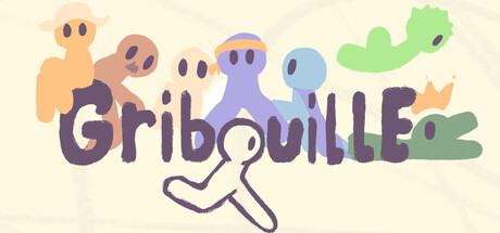
GRIBOUILLE scores 73/100 — better than 59% of Adventure capsules (n=8,547).
1 user reviews · $9.99 · Released Dec 1, 2025 · By HYJAZI
GRIBOUILLE scored 73/100 on Steam Analyzer — Good for a Adventure capsule. Top priority fix: [title_readability] Add subtle dark outline or shadow to GRIBOUILLE text to maintain crispness at tiny sizes without compromising hand-drawn aesthetic.
Steam app ID: 4050690 · Tags: Adventure, Platformer, Collectathon, 2D Platformer, 2D