Scoring genre clarity...
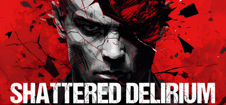
Shattered Delirium is a first-person perspective psychological horror game. Explore a dark, atmospheric world that combines realistic visuals with unsettling audio. Interact with items, solve puzzles and riddles, discover collectibles, and learn the truth of the world of Shattered Delirium!
$1.99
ExplorationHidden ObjectPuzzle
Jeremy BahnOct 22, 2025