Scoring genre clarity...

Fresh Squeezed Lemonade capsule

Fresh Squeezed Lemonade

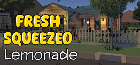
Set up your stand, process fresh lemons, scoop ice, and serve the perfect drink to your neighbors. Build your popularity one satisfied customer at a time in this cozy, moderate-paced simulation full of sunny days, friendly faces, and the simple joy of sharing lemonade.

$5.995 user reviews
SingleplayerExplorationTime Management
SYRBYRT STUDIOS LLCDec 30, 2025

Fresh Squeezed Lemonade scores 78/100 — better than 84% of Singleplayer capsules (n=16,133).

5 user reviews · $5.99 · Released Dec 30, 2025 · By SYRBYRT STUDIOS LLC

Quick text summary

Fresh Squeezed Lemonade scored 78/100 on Steam Analyzer — Good for a Singleplayer capsule. Top priority fix: [uniqueness_polish] Redesign as a custom capsule featuring the customer interaction or drink-serving mechanic visually—show a customer receiving lemonade or a busy stand moment to communicate the gameplay loop.

Capsule scores by dimension

  • Genre Clarity: 8/10 — Clear casual simulation vibes. The residential suburban setting with a lemonade stand immediately signals a cozy life sim or casual business game. The bright daylit neighborhood, wooden houses, and idle stand setup clearly communicate a low-stakes management experience rather than action or challenge-based gameplay. At tiny size, the stand and residential architecture remain readable enough to telegraph the genre intent.
  • Title Readability: 9/10 — Bold, legible, excellent contrast. The large yellow 'FRESH SQUEEZED' text with black outline dominates the upper half and maintains perfect legibility at all sizes down to tiny thumbnails. The white 'Lemonade' subtext below provides clean secondary hierarchy without competing for attention. Both elements sit on a controlled background region (sky) rather than noisy texture, and the outline technique ensures zero collapse at small sizes.
  • Contrast & Color: 8/10 — Strong warm palette with separation. The bright yellow title and golden house tones create excellent value separation against both the Steam dark background and the blue sky. The stand and foreground elements use warm wooden tones that pop cleanly against the cool blue sky and green grass, establishing clear silhouette hierarchy. In grayscale, the yellow-to-sky contrast remains strong, though the golden house and grass could read as slightly closer in value.
  • Uniqueness & Polish: 7/10 — Competent scene with pleasant craft. The capsule features a well-rendered neighborhood environment with consistent 3D art direction and appealing color grading that reflects the game's sunny, cozy aesthetic. However, the scene composition feels like a straightforward location screenshot rather than a custom-designed capsule that communicates a unique mechanic or selling point—it's more 'showing the setting' than 'selling the gameplay loop'. The visual storytelling is pleasant but not distinctive enough to stand out in a crowded casual sim space.
  • Brand Consistency: 7/10 — Cohesive art style, clean identity. The capsule establishes a consistent warm, sunny aesthetic with a unified color palette (golds, greens, blues) that matches the game's cozy simulation tone. The art style appears to use a consistent 3D rendering approach across the scene, supporting brand recognition as a wholesome life sim. No iconic character or signature motif is present, limiting memorability compared to genre leaders, though the overall cohesion is solid.
  • Composition: 8/10 — Clear hierarchy, strong focal point. The title occupies the top third with confident placement, the lemonade stand is the clear primary focal point in the center-foreground, and the residential backdrop provides context without competing. The composition uses depth layering effectively—foreground stand, midground trees and houses, background sky—guiding the eye naturally through the scene. At small and tiny sizes, the stand remains the dominant visual anchor and the title never gets lost.

What works

  • Title legibility and contrast. Yellow bold text with black outline ensures perfect readability at all sizes and stands out sharply against both the sky and dark Steam background.
  • Cohesive warm color palette. Unified golds, greens, and blues create a pleasant, recognizable aesthetic that communicates the cozy simulation tone effectively.
  • Clear focal point and depth. The lemonade stand anchors the center, with layered background environment creating visual hierarchy that reads well at thumbnail size.

What hurts the capsule

  • Generic setting over unique mechanic. The capsule shows a neighborhood rather than visually communicating what makes this lemonade game distinctive—the actual gameplay loop or unique selling point remains unclear.
  • No iconic character or motif. Unlike top-performing genre peers (DAVE THE DIVER, Little Kitty Big City), there is no memorable character or signature visual element that would aid brand recall.
  • Missed custom design opportunity. The capsule appears to be a screenshot of the game world rather than a purposefully designed marketing image, reducing impact compared to intentional capsule artwork.

Priority fixes

  1. [uniqueness_polish] Redesign as a custom capsule featuring the customer interaction or drink-serving mechanic visually—show a customer receiving lemonade or a busy stand moment to communicate the gameplay loop.
  2. [brand_consistency] Introduce a signature element (a distinctive customer character, a memorable stand design detail, or an iconic visual motif) that can anchor future marketing and aid recognition.
  3. [composition] Shift the lemonade stand slightly off-center and add a clear visual indicator of player action (pouring, serving, or busy activity) to emphasize the interactive simulation nature.

Store copy priority fixes

  1. [uniqueness] Add a sentence to the short or opening detailed description that articulates one specific mechanic or system that sets this stand apart—e.g., 'recipe memory system,' 'neighborhood relationship arc,' or a unique visual/audio hook that competitors lack.
  2. [feature_communication] Integrate the Features list more naturally into the detailed description body so mechanics feel like narrative payoffs rather than a separate checklist—e.g., 'As you unlock faster juicers and ice machines, you'll keep pace with the summer rush.'
  3. [hook_strength] Strengthen the opening line of the detailed description with a more distinctive hook—e.g., start with a customer-facing moment or a specific challenge rather than 'Welcome to the neighborhood.'

Related guides

Steam app ID: 4051080 · Tags: Singleplayer, Exploration, Time Management, Immersive Sim, Casual