Scoring genre clarity...
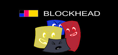
Blockhead is lost. Can you help Blockhead find his way home? Move through 50 challenging levels by getting tokens, avoiding the bullies and getting help from the characters around you. Use keyboard and X Box controller to move and jump through this 2D platform game.
$2.99No user reviews
2D PlatformerCasualPuzzle Platformer
camynotOct 23, 2025