Endless Space Scrap scores 62/100 — better than 2% of Top-Down Shooter capsules (n=801).

Quick text summary

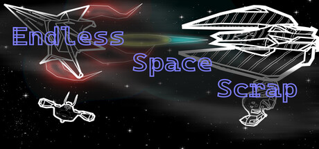
Endless Space Scrap scored 62/100 on Steam Analyzer — Solid for a Top-Down Shooter capsule. Top priority fix: [title_readability] Consolidate the three-line title into a single line or two-line layout with larger letterforms and thicker neon stroke to maintain legibility at TINY size.

Capsule scores by dimension

  • Genre Clarity: 7/10 — Space action arcade dodge mechanics. The capsule clearly communicates a space-themed action game through white line-art spacecraft, asteroids, and a salvage/collection premise. At TINY size, the spaceship silhouettes and asteroid elements remain identifiable, though the specific dodge-and-collect mechanic is not immediately obvious from visuals alone. Genre signals are strong enough to suggest arcade action in a space setting.
  • Title Readability: 5/10 — Title legible at full size, fails at tiny. The three-line blue neon text 'Endless Space Scrap' reads clearly at full header size with good contrast against the dark background. However, at TINY thumbnail size (120x45), the text becomes difficult to parse quickly—the thin neon outline loses definition and the three-line stacking creates visual clutter that collapses under the squint test. The tagline spacing is inefficient for small viewport legibility.
  • Contrast & Color: 7/10 — Strong silhouette separation, good value. White line-art ships and asteroids pop cleanly against the dark space background (#1b2838 equivalent), and the red/pink neon glow on the left element adds warm accent contrast. In grayscale, silhouettes remain distinct and edges are sharp, supporting quick recognition. At SMALL size, the contrast holds well, though at TINY the thin neon strokes lose some definition.
  • Uniqueness & Polish: 6/10 — Competent neon style, generic space premise. The neon outline aesthetic and starfield background are well-executed and cohesive, but the overall composition feels like a standard space game template rather than a distinctive visual hook. The white line-art ships are clean and technical but lack a memorable character or unique selling point that differentiates it from other space indie games. Polish is present in the craft, but the concept reads as familiar rather than novel.
  • Brand Consistency: 6/10 — Consistent neon tech aesthetic internally. The capsule maintains a coherent neon-outlined technical style with a clear dark space background palette, suggesting internal brand consistency. However, without reference to other game materials, there are no distinctive brand identity signals—no signature character, unique motif, or iconic color beyond generic space game tropes. The style is recognizable within this capsule but not memorable as a distinct brand identity.
  • Composition: 6/10 — Balanced layout, unclear focal point. The composition spreads attention across three main elements: left neon swoosh, center spacecraft cluster, and right ship outline, creating a horizontal balanced layout. However, there is no clear primary focal point—the eye doesn't settle on a single hero element, reducing impact at SMALL and TINY sizes. The title placement across the entire composition fights for attention rather than anchoring it, and the scattered arrangement of ships creates visual diffusion rather than hierarchy.

What works

  • Clean white line-art silhouettes. Ship and asteroid outlines are sharp, technical, and distinct against the dark background, maintaining clarity even at reduced sizes.
  • Strong contrast and color separation. Neon blue text and red glow elements create warm-cool visual interest and pop against the space background without muddiness.
  • Coherent space theme execution. Starfield, spacecraft, and salvage elements work together to communicate a cohesive space-salvage gameplay premise.

What hurts the capsule

  • Title readability collapses at tiny size. The three-line neon text stacking becomes illegible and loses definition at TINY thumbnail size (120x45), harming discoverability in quick scroll.
  • No clear focal point or hierarchy. Three competing elements (left swoosh, center ships, right ship) spread attention equally, creating visual diffusion instead of a dominant hero image.
  • Generic space game template feel. The neon outline style and starfield background, while well-executed, lack a distinctive visual hook or memorable brand identity that stands out from other space indie games.

Priority fixes

  1. [title_readability] Consolidate the three-line title into a single line or two-line layout with larger letterforms and thicker neon stroke to maintain legibility at TINY size.
  2. [composition] Establish a clear focal point by enlarging the center spacecraft cluster and repositioning title to a safe margin (top or bottom) to create visual hierarchy and guide the eye at SMALL size.
  3. [uniqueness_polish] Introduce a distinctive visual hook—such as a signature character, unique ship design, or standout color accent—that differentiates the brand from generic space games.

Store copy priority fixes

  1. [hook_strength] Rewrite the detailed description opening to match the punch of the short description: replace 'Move, catch and survive as you can!' with something like 'Salvage. Upgrade. Survive.' to create immediate momentum.
  2. [uniqueness] Add 1–2 sentences explaining what makes the Module Limits Rewards system or the salvage-stacking upgrade path unique compared to other horde survivors (e.g., 'Unlike traditional survivors, every overfilled module triggers auto-repair, creating risk-reward tension').
  3. [audience_targeting] Clarify the difficulty and pacing target: state whether this is accessible arcade fun or a challenge for bullet-hell fans seeking intense dodging moments to help the right player recognize this is for them.
  4. [feature_communication] Mention whether runs have defined end conditions (waves, time limits, score thresholds) or if 'endless' is truly infinite, and hint at replayability systems (unlocks, difficulty modifiers) to strengthen the long-term value proposition.

Related guides

Steam app ID: 4054080 · Tags: Top-Down Shooter, Action, Top-Down, Casual, Arcade