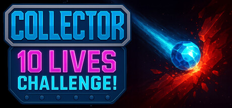
Collector: 10 Lives Challenge scores 62/100 — better than 3% of Casual capsules (n=10,153).

Quick text summary

Collector: 10 Lives Challenge scored 62/100 on Steam Analyzer — Solid for a Casual capsule. Top priority fix: [genre_clarity] Replace abstract energy orb with a collector-specific icon or visual—such as a stylized coin/gem grid, a hand gathering objects, or a progress indicator—to signal pattern-collection and survival mechanics at tiny size.

Capsule scores by dimension

  • Genre Clarity: 5/10 — Abstract energy, unclear gameplay type. The glowing orb and energy effects suggest action or puzzle mechanics, but could indicate arcade, action, puzzle, or even strategy games. At tiny size, the abstract blue and red energy vortex reads as generic visual effect rather than communicating a specific genre identity or core mechanic like pattern-matching, collection, or survival-based challenge.
  • Title Readability: 8/10 — Strong hierarchy, reads well at small size. COLLECTOR is prominent in bright cyan with bold outline, while 10 LIVES CHALLENGE sits clearly below in magenta. Both title blocks have clean cyan outlines and strong contrast against the dark background. At tiny size, the main text remains readable, though the challenge tagline becomes secondary; the blue neon styling holds clarity across all viewing scales.
  • Contrast & Color: 7/10 — Good value separation, strong neon pop. Cyan and magenta neon text create clear silhouettes against #1b2838 with bright value lift. The central blue-red energy orb has strong luminance contrast, though the surrounding red explosion blends slightly into the darker edges. At small size, the text blocks read cleanly; at tiny size, the neon outlines preserve legibility, though the energy effect becomes a soft glow rather than distinct shape.
  • Uniqueness & Polish: 6/10 — Competent neon style, generic energy theme. Clean neon typography and lighting effects show technical craft, but the glowing orb and particle explosion are familiar arcade/energy game tropes with no distinctive visual hook that signals the core mechanic or differentiates this from similar indie titles. The capsule communicates 'arcade challenge' generically rather than highlighting what makes a 10-lives pattern-collection game unique.
  • Brand Consistency: 5/10 — No memorable identity or signature motif. The cyan and magenta neon palette is consistent and clean, but lacks any iconic character, collector symbol, or recurring visual motif that would make this capsule recognizable as a specific brand. Without reference to the 10 store screenshots, there are no internal cues that establish a distinctive identity beyond generic neon arcade aesthetics.
  • Composition: 6/10 — Balanced layout, clear hierarchy issues. Title text is anchored to the left in a controlled region with strong readability, while the energy orb occupies the right side creating visual balance. However, the composition lacks a dominant focal point—the text and effect compete equally rather than one clearly guiding attention first. At tiny size, the layout flattens slightly and the effect becomes secondary blur, which is acceptable but not compelling.

What works

  • Neon title legibility. Cyan and magenta outlined text remains readable at small and tiny sizes with strong outlines and high contrast against dark background.
  • Clean layout structure. Title block on left and effect on right creates balanced composition with no awkward empty gaps or edge-hugging elements that would be cut by Steam crop.
  • Technical craft polish. Neon glow effects, outline strokes, and lighting are rendered cleanly without artifacts or cheap asset feel.

What hurts the capsule

  • Generic energy visual. Blue-red glowing orb and explosion are familiar arcade tropes that communicate 'action game' rather than the specific pattern-collection and survival mechanics of this title.
  • No genre clarity at tiny size. Abstract energy effect provides no gameplay iconography—collector basket, pattern grids, or survival indicator—so the capsule reads as unspecific action rather than a unique indie puzzle-arcade hybrid.
  • Weak brand identity anchor. No iconic character, symbol, or signature motif visible to establish recognizable brand consistency or memorable visual hook across multiple capsule exposures.
  • Focal point ambiguity. Text block and energy effect have equal visual weight, creating scattered attention rather than a primary subject that guides the eye hierarchy.

Priority fixes

  1. [genre_clarity] Replace abstract energy orb with a collector-specific icon or visual—such as a stylized coin/gem grid, a hand gathering objects, or a progress indicator—to signal pattern-collection and survival mechanics at tiny size.
  2. [uniqueness_polish] Develop a distinctive visual motif or character symbol that communicates the 'one-button challenge' or '10 lives' core mechanic rather than generic arcade energy.
  3. [brand_consistency] Introduce a signature visual element or palette variation unique to this game across title area and effect to build recognizable brand identity.
  4. [composition] Strengthen focal point hierarchy by making the title block or a collector-specific icon the dominant primary subject, with the energy effect as supporting secondary visual.

Store copy priority fixes

  1. [audience_targeting] Clarify the family-friendly positioning—either emphasize accessibility for younger players in the opening, or remove the family-friendly tag if the game is intended for hardcore players only.
  2. [uniqueness] Add a sentence in the "Why Play?" section explicitly stating what makes the 10-life shared pool mechanic different from traditional roguelikes (e.g., 'Unlike roguelikes that reset progress each death, Collector shares one life pool—every decision compounds.').
  3. [feature_communication] Explain or remove the 'Sailing' tag if it is not relevant; if it is thematic (e.g., a sailing-themed orb or world), add a sentence to the setting description.

Related guides

Steam app ID: 4054150 · Tags: Casual, Arcade, Puzzle, Roguelike, Incremental