Scoring genre clarity...

Devestor capsule

Devestor

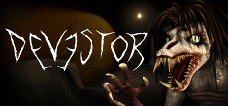
This isn’t a story-driven horror game, it’s a challenge! Across 10 haunted levels… You’ll face Jumpscares, Puzzles, Parkour, Mini-Games, and a Roaming Monster that truly hates you. Your only hope lies in the notes left by some clueless idiot who came here just like you… and never made it back.

$9.993 user reviews
First-PersonActionCasual
DiMon GamesOct 29, 2025

Devestor scores 72/100 — better than 50% of First-Person capsules (n=4,391).

3 user reviews · $9.99 · Released Oct 29, 2025 · By DiMon Games

Quick text summary

Devestor scored 72/100 on Steam Analyzer — Good for a First-Person capsule. Top priority fix: [title_readability] Increase font weight or add subtle outline to DEVESTOR title to maintain letterform clarity at TINY sizes without losing the distressed aesthetic.

Capsule scores by dimension

  • Genre Clarity: 8/10 — Horror action with clear threat. The grotesque monster face with bared teeth and menacing expression immediately communicates horror-action gameplay. The distressed hand gesture in the foreground reinforces danger and survival threat, while the dark atmospheric lighting supports the haunted setting premise. At TINY size, the monster silhouette and red mouth detail remain recognizable as horror content, though parkour and puzzle elements are not visually implied.
  • Title Readability: 7/10 — Legible angular title with minor sizing loss. DEVESTOR uses an intentional distressed, jagged angular font that maintains reasonable contrast against the dark background. The title placement on the upper left avoids the monster face and has adequate breathing room. At TINY size the letters remain distinguishable but lose some character definition due to the thin spiked edges of the font; the spiky aesthetic reads more as texture blur than readable text at smallest scales.
  • Contrast & Color: 8/10 — Strong value separation and silhouette clarity. The monster face features high contrast with pale skin tones against deep shadow, and the red mouth creates a bright focal point that pops against the dark background. The pale distressed hand in the foreground has clear separation from the darker midground. In grayscale test, the value range from dark background to light flesh and bright mouth remains strong, supporting excellent readability at SMALL and TINY sizes.
  • Uniqueness & Polish: 7/10 — Effective horror aesthetic, moderate distinctiveness. The grotesque monster character design and distressed hand pose effectively communicate the roaming monster threat described in the game description, showing visual storytelling beyond a generic scene. The rendering of the creature has solid craft with detailed facial features and atmospheric lighting effects. However, the composition falls within familiar horror game capsule conventions, and without additional UI or environmental context hinting at parkour or puzzle elements, it reads more as standard horror-action rather than distinctly representing the unique multi-mechanic challenge blend.
  • Brand Consistency: 6/10 — Established monster character, minimal identity system. The grotesque monster appears to be the primary antagonist and is rendered with consistent detail and style that could anchor brand recognition if used across promotional materials. The pale-faced creature with distinctive red mouth creates a memorable focal point for potential brand iconography. However, there is minimal color palette cohesion, typography hierarchy, or secondary visual motifs that would create a recognizable identity system across touchpoints; it relies heavily on the monster character as the sole brand signal.
  • Composition: 7/10 — Clear focal point, balanced supporting elements. The monster face dominates the right-center composition with the distressed hand in the foreground left creating a secondary focal point that guides the eye. The title placement in the upper left establishes hierarchy without competing for attention. At TINY size the monster silhouette and hand gesture remain the clear primary subject with good depth layering between foreground hand, midground monster, and background atmosphere; however, the right-edge positioning of the monster face risks cropping in some Steam layouts.

What works

  • Strong horror silhouette and expression. The grotesque monster face with bared teeth and menacing red mouth is immediately recognizable as a threat and communicates genre effectively even at tiny viewing sizes.
  • Clear atmospheric lighting and value contrast. The pale creature against dark background creates strong visual separation that reads clearly at small sizes and supports the haunted survival setting.
  • Intentional hierarchical composition. Title placement avoids the monster subject, and foreground hand guides the eye naturally without competing for primary attention.

What hurts the capsule

  • Distressed font loses detail at tiny scales. The angular spiked letterforms of DEVESTOR become difficult to parse at TINY size due to thin strokes that blur into texture rather than remaining clearly legible.
  • Generic horror-action positioning without unique gameplay hints. While the monster threat is clear, there are no visual cues suggesting parkour, puzzles, or the challenge-based multi-mechanic nature that differentiates this game from standard horror titles.
  • Monster face cropping risk at right edge. The monster's right-side positioning places key facial details close to the edge where Steam crop protocols may cut off important visual information depending on layout.

Priority fixes

  1. [title_readability] Increase font weight or add subtle outline to DEVESTOR title to maintain letterform clarity at TINY sizes without losing the distressed aesthetic.
  2. [composition] Shift monster face slightly toward center-left to create safer margins from edge cropping while maintaining visual hierarchy.
  3. [genre_clarity] Add a subtle environmental detail or UI element in the background that hints at parkour or puzzle elements to communicate the unique multi-mechanic challenge design.

Store copy priority fixes

  1. [hook_strength] Strengthen the short description by leading with an active verb ('Survive ten haunted levels filled with…') rather than a negation, making the hook more visceral and immediate.
  2. [uniqueness] Add 1-2 sentences in the detailed description explaining what makes Devestor's design philosophy distinct—e.g., how the roaming monster mechanic, puzzle + parkour blend, or note-gathering system creates a novel experience.
  3. [tone_match] Maintain the sardonic, confident voice from the short description into the detailed description to create consistency and personality throughout the entire copy.

Related guides

Steam app ID: 4054530 · Tags: First-Person, Action, Casual, Horror, Psychological Horror