Scoring genre clarity...

Block-Lite capsule

Block-Lite

Block-Lite is a simple, fast-paced roguelite! Choose your character, grab a weapon, and fight through wave after wave of enemies until you become unstoppable.

$1.995 user reviews
Action RoguelikeArena ShooterBullet Hell
Camden FolkmanOct 13, 2025

Block-Lite scores 70/100 — better than 25% of Action Roguelike capsules (n=1,675).

5 user reviews · $1.99 · Released Oct 13, 2025 · By Camden Folkman

Quick text summary

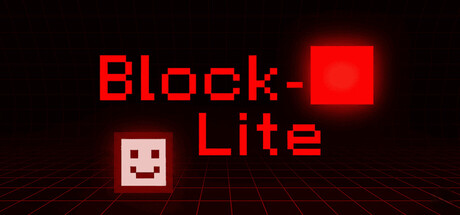
Block-Lite scored 70/100 on Steam Analyzer — Good for a Action Roguelike capsule. Top priority fix: [uniqueness_polish] Integrate a distinctive visual element or color accent that differentiates Block-Lite from standard pixel roguelites and creates a memorable brand symbol.

Capsule scores by dimension

  • Genre Clarity: 7/10 — Clear roguelite action signal. The pixelated cube character, grid floor perspective, and red block combat visual immediately suggest a roguelite or arcade action game. At TINY size, the blocky aesthetic and grid environment still read as indie action. However, the specific roguelite progression mechanic is not visually obvious without context.
  • Title Readability: 8/10 — Bold, legible title at all sizes. The bright red blocky font for 'Block-Lite' maintains excellent contrast against the dark background and remains readable even at TINY thumbnail size. The text is large, well-spaced, and uses consistent letterforms that don't collapse under scaling. Strategic placement in the upper-center area keeps it clear and avoids cluttering the visual hierarchy.
  • Contrast & Color: 8/10 — Strong red-on-black value separation. The bright neon red title and the red cube in the upper right create sharp, high-contrast separation from the dark background. The white face on the character cube and the grid floor lines add secondary value contrast that guides the eye. In grayscale, the mid-tone grid and character maintain clear silhouettes against dark space, supporting visibility at small sizes.
  • Uniqueness & Polish: 6/10 — Clean pixel aesthetic, somewhat generic. The pixel art style and neon red color scheme are cohesive and well-executed, but pixel roguelites and retro aesthetics are common in indie games. The smiling face character is charming but not distinctly memorable compared to top-tier indie capsules. The composition is functional and polished, but lacks a unique visual hook or storytelling element that sets it apart from other indie action titles.
  • Brand Consistency: 6/10 — Consistent pixel style, limited identity. The capsule maintains a coherent pixel art style with a warm red and dark palette that would likely carry through store screenshots. However, without a distinctive character design, iconic symbol, or signature visual motif beyond the blocky aesthetic, the brand identity feels generic. The simple smiley face cube is recognizable but not especially iconic or memorable as a brand symbol.
  • Composition: 7/10 — Clear hierarchy, balanced layout. The title anchors the top, the character cube sits in the lower left for balance, and the floating red block in the upper right creates visual interest and draws the eye. The grid floor adds depth and establishes the game's visual language. At SMALL and TINY sizes, the focal point remains clear, though the floating block is a minor secondary element that could compete slightly with the main title.

What works

  • Excellent title contrast and legibility. Bright red blocky font maintains perfect readability at TINY size against the dark background with strong value separation.
  • Coherent pixel art direction. Consistent retro style with neon red color scheme and grid environment creates a cohesive, polished visual language.
  • Clear focal point hierarchy. Title, character, and floating block work together to guide the eye without creating scattered attention across sizes.

What hurts the capsule

  • Generic pixel roguelite aesthetic. The retro blocky style and neon colors are common in indie games, limiting visual distinctiveness compared to top-tier titles.
  • Unmemorable character design. The simple smiley face cube is functional and charming but lacks iconic or memorable brand identity potential.
  • Missing unique visual hook. The capsule communicates genre competently but does not visually communicate a specific unique selling point or core mechanic beyond 'retro action game.'

Priority fixes

  1. [uniqueness_polish] Integrate a distinctive visual element or color accent that differentiates Block-Lite from standard pixel roguelites and creates a memorable brand symbol.
  2. [genre_clarity] Add a subtle roguelite progression indicator or wave counter visual element to strengthen the specific game mode communication.
  3. [brand_consistency] Introduce a signature design motif or icon that would scale and remain recognizable across all store marketing materials and thumbnails.

Store copy priority fixes

  1. [hook_strength] Rewrite the opening to lead with a core gameplay hook: 'Choose your class, evolve your weapons, and survive escalating enemy waves—each run plays differently with 90+ character-weapon combos.'
  2. [uniqueness] Add a differentiating statement after the feature list, such as 'Built in TurboWarp for snappy, responsive arcade action' or highlight what makes the progression/meta unique.
  3. [feature_communication] Add 1–2 concrete examples to the weapon evolutions bullet: e.g., 'Shotgun transforms into a homing projectile launcher' to show mechanical variety.

Related guides

Steam app ID: 4055580 · Tags: Action Roguelike, Arena Shooter, Bullet Hell, Shoot 'Em Up, Top-Down Shooter